In order to gather visual information for the Studio Brief 1 and Study Task 1, I took my camera and head to the city centre and see how many way finding signs I was able to photograph. I was able to see examples of good practice and others of bad practice.
Street signage for pedestrians is clearly designed for this purpose, as it is above heads to avoid obstacles when reading and does not have a massive size for the font, so it's unlikely that car drivers can read it. The contrast between white letters and blue or grey background makes it easier to read. Only important buildings or institutions are represented with symbols (like train station), which makes easier to identify them if that is what one is looking for. Although, there is no consistency between the colours and shapes of different signs. The grey signs have the arrow within the shape of the sign itself, while in the blue ones it is illustrated on the top right. There is definitely a consistency between this blue kind of signage and the ones with the map.


The map uses the colours yellow and blue to divide areas in the city. The red to make the viewer easily identify where he is at that moment. It is big enough so more than one people can check the map and the information is still legible.

The entrance to the German Market is clearly identified by this temporary arch with the title written at the top centre of it.

Yellow road signage is temporary, while the white is fixed. Despite their difference in colour, there is a consistency in the design: the illustrated arrow and the shaped sign.

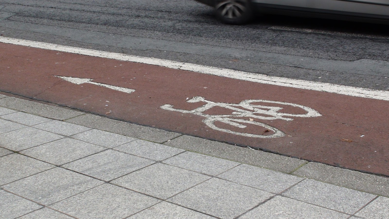
Also the roads themselves are used for way finding purposes. Important to notice how the arrows are designed. Not directly pointing in a direction, but it gives time to the driver to follow the line with the eyes.


The main galleries were closed on Monday (they open the rest of the week). Although I got into the library to get some signage and I found some inconsistency in it. They used the same font, sizes and colours to indicate directions, but they had the information either on board signs or illustrated on the wall. That can be a problem for someone who is only looking for the board signs thinking that is the only way information is displayed.


There was way finding outside as well. There could be a more professional indication on the door to indicate where to go when the gallery is closed, but at least it keep some consistence with the colour and font of the signage outside.


Disable access indicated outside Henry Moore institute.

UK regulatory signage for fire exit and the obligation to keep the way clear.

Text within an arrow to indicate a doctor's surgery in The Light.

International signage for escalators. Clearly understandable without the use of words.

Information hard to find in The Light. I did't really understand why they used different colours for the floors if there was just one signage (that I could find) in each floor.


Cinema way finding. 'Upstairs' concept easily represented to show where are certain rooms.


More international signage for information. The text is probably to make it look those regulations friendlier, as it doesn't give extra information.

'Automatic door' written in english with black text on white background and viceversa. Don't see the use of both of them and it could be easily represented with symbols, as Santander bank do in the next picture.


Leeds Station clearly identified from City Square. The position of it is clearly not accidental, is made it that way. It also has the signage of Metro, the transport company, and the one of train station.


These signage have the same design pattern as road signage, but they are for pedestrians to inform where to go to have access to different buses.

A church for all religions have a text on it but also the symbols of the beliefs, so there it is not mistake and no language boundary.


Bus routes map. Yellow background and white for streets not used by buses. Every bus has a colour assigned and the number is indicated throughout its line.

Examples of good signage and bad signage. It would be much more effective to represent the second one with a shape rather than with text. Even more next to the train station, where tourists that don't speak English may be.


In this phone booth the telephone is a symbol, but "Coins & Cards" is written. The colour red works well as all the surrounding signage have other colours, like blue, white or yellow.

All the train station has the blue signs above a green line with a sans-serif clear font on it (Helvetica? Univers?). The way finding system is quite consistent, and everything that can be illustrated with symbols it's done that way.


The problem with translating something to many languages it's risky, and a good example of it is this. There is a piano that can be played by anyone in the station, and it says "play me" on it in different languages. I don't know about the other languages, but in Spanish says "Juégame", which doesn't makes sense at all. The actual translation should be "Tócame" (literally touch me), so there are probably more mistakes. It would be much more effective to use a single symbol.


I also took a tour in some supermarkets. The first one is Tesco, which illustrates sections with images and names. While in Wilco they simply use words using the colour of the brand as a background. If one gets in Wilco we don't need to be reminded where we are, so I think those signs and colours could be of more use.


Within the Trinity shopping center I looked at the signage and the signage was very clearly and consistently designed. The floors had different colours like in "The Light", but in each floor those colours were widely used. Also the bins with the recycling system are very easy to spot. One doesn't need to spend too much time looking where to throw away what.


Part of the Leeds College of Art signage system is consistent. Similar to the one used in the train station, its a grey background with a white line underneath and Helvetica for indications.


Medical systems with regulated signage.


An arrow can be more helpful than we think in order to find "the other door"


Very inconsistent use of signage to illustrate the functions of the rooms.


More examples of clear and succesful use of signage. Although, the green bin illustration should have a green background too.


These are examples of signage that is useful and very minimalistic, but the rest of the building doesn't use it.


No comments:
Post a Comment