At first I thought of using a sans-serif font since it made more sense that something thoughtless would have to be relaxed and informal. But after some experimentation I found out that it lacked of expression, strength and the modifications looked quite on purpose rather than something actually accidental and thoughtless.


I also tried to add some irregular serifs and brackets to Universe, but I discarded this idea straight away since it took an immediate different meaning: Mutant. I cannot say exactly why, but it reminded me of the character Nemesis from Resident Evil 3.


It then was when I wondered: Do I really want to stick with sans-serif? Maybe it was too serious for this, but I did not want to make the typeface look necessarily relaxed, but inconsiderate and unwary.


So looking again throught the typefaces in detail I realised Garamond was very irregular, which matched the word I used to define my own typeface even before I knew what it was going to look like.
With the right enhancement of irregularities, Garamond could be the thoughtless typeface I was looking for. I realised it when I saw the "T" letter and it became more obvious when I converted the letters to strokes. The letter was full of anchor points, which is something I really dislike when designing something... so I thought to take advantage from it.

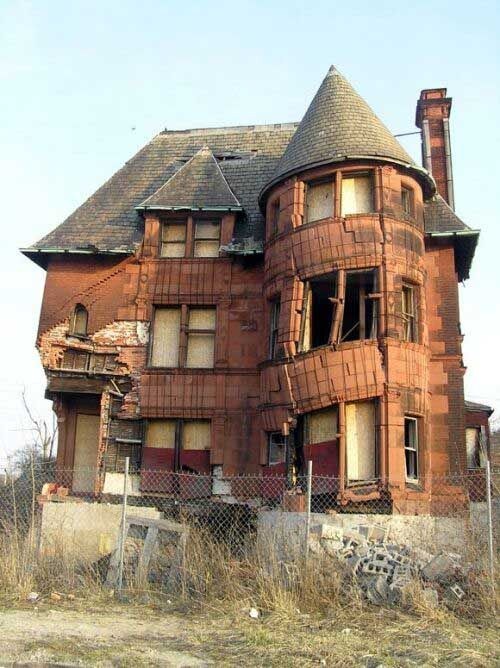
I also looked through some examples of thoughtless architecture and thinking about how a thoughtless person appearance would be like if exaggerating the characteristics, so I concluded that using thin strokes to remove strength and convey instability as well as not smoothing strokes at all (that would be what a thoughtful person would do) it would make it look more neglected and rough, like it's made without any kind of care. Rotation of letters and adaptation of the serifs and brackets to make the letter rest but with a "hunched" aspect.

I first drew over the original typeface to have a rough idea of what I was going to do, but it was very limited since I couldn't move the baseline and rotate them. Once on the computer, I wrote the full alphabet in illustrator, convert it into path and started moving the anchor points. I continued with this practice since I considered it was the most effective method to modify an existing typeface. Besides, if I wanted to avoid the handwritten effect and add a more vectored and computerised one then I should do it from Illustrator.

No comments:
Post a Comment