Despite I wanted to go as thoughtless as I could I had to set boundaries. After checking different grids on the books "Grid Systems in Graphic Design" by Josef Müeller-Brockmann and "The New Typography" by Jan Tschichold I understood that a simple grid would make the work easier and, even though I wanted to be irregular and without rules, some limitations where needed in order to keep the typeface functional. Like Erik Spiekermann suggests on his blog: "Mess around a lot first". I made a basic grid that allowed me a 0.5mm baseline shifting and limited my range of action towards the sides, taking the size from the original Garamond.

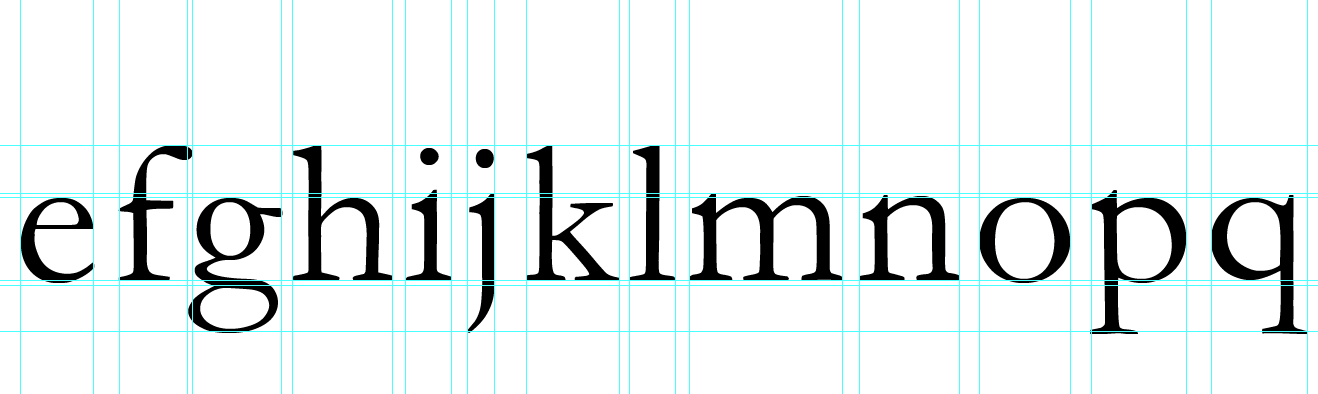
Everything was planned to make the typeface look different, but when designing it I usually made the same decisions with the different parts of the letters. Even though these decisions can be simplified to usually two ways of action the process was not copied to one to another or measured, so the result was always different:
- Serifs, brackets and the ear of the letter 'g' were either crushed or enlarged. Did not matter how much at this stage.
- Bowls, counters, apertures and the eye of the letter 'e' were rotated and made irregular, making them not to match with other parts. For instance, the letter 'd' or 'b'. Smooth curves were roughed up.

- Ascenders and descenders were also crushed or enlarged and displaced from the main body of the letterform to increase the sensation of irregularity.
There is always irregularity between similar characters like "q" and "p", "O" and "Q" and so on. A thoughtless designer would do that and don't have a continuity and consistency in shapes.
After "going crazy" with alterations and looking for a design that irritates a perfectionist and thoughtful person, the result was a typeface that could be called scary probably because of its unexpected and sharp strokes. I thought there could be a human association between something scary and unexpected, like a mad person with a knife in a horror film, no one knows what is that character is going to do next, so it creates tension.


The result was not far from the main idea, but I wanted to give a step back from the scary look to avoid sending the wrong message with the letters. Then I remembered what Simon said in one of the lessons: sometimes you have to go far with a design and then start stripping it down to have a simpler result. So I started removing the sharpness of the letters by rounding the edges and avoiding shapes that were too thin, large and hanging. The rid of excess of anchor points and adjustments to the remaining ones should also bring a more polished appearance without the waves, but in a thoughtless nature due to the new position of the elements.

 |
| Before |
 |
| After |

As it can be seen, the result is more friendly and not that scary.
During this process I came up with the idea of using the tablet to draw the strokes of the letters of Garamond very thoughtlessly without trying to be precise, but the result was a wavy kind of Garamond that did not convey thoughtlessness, but mere distortion that could be associated with water or electricity, for instance. I did to see if I could avoid going that far with the letters. Like I said, this is not my usual modus operandi and I didn't feel very sure about what I was doing, but after trying this it just helped me to rely more on my previous idea.

No comments:
Post a Comment