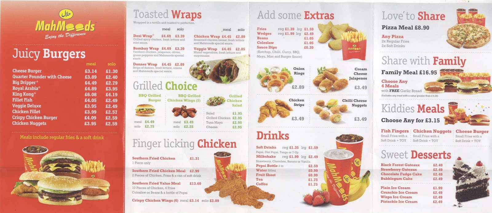
The use of the red colour on text is to emphasise on key words like "FREE", the main word of the headings and also to highlight the 3 or 4 words dishes as well as the price, even though the price is grey for sidedishes, which is confusing as they are not easily noticeable as the others. The rest of the text is mostly grey, excepting for a green section (which I first thought was for vegetarians) called Grilled Choice that shows not only a Grilled Chicken Salad, but also BBQ Grilled Chicken Wings, not very green food.
Along the menu it is possible to count up to 5 different typefaces, some in bold that added to the use of many different colours makes the menu confusing and apparently without any particular order. The communication is poor and lacks of a particular objective.
Legibility is not an issue excepting for the two burgers that form the letters "OO" on the name of the restaurant. I was not able to tell the name of it if it was not for the website. Although the readability is quite problematic as there is a high contrast between colours white and red and also a use of bold with red colour and small size of letter.


Although I identified some problems this menu has I have to admit it is a difficult design to make. There are many things to consider and to include in a reduced amount of space, but I think that is another reason to keep it simple. Overuse of typefaces, colours and images only makes the experience of reading a fast food menu confusing, and also the addition of ornamentation or gradients can be very problematic for the reader. Less is more.
No comments:
Post a Comment