
I really wanted to use more complicated grids in order to put more order in chaos to the design. So I asked if I should do that or if I should keep them simple. I was told that it depended if the typeface was going to be for a body text or for a title. If it needs to be legible more rules should be applied, while if it is going to be for a title it does not necessarily have to have strict rules.
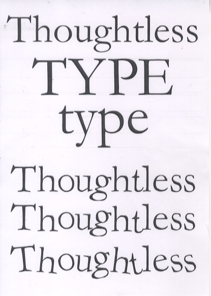
I also asked friends to have an outsider point of view and that also help me to identify the most obvious problems, such as the scariness the typeface acquired during the production process and it also was a relief to share my thoughts with an illustrator and knowing that he came up with the same solution as me: getting rid of the sharp shapes.
No comments:
Post a Comment