In order to promote among our classroom the Film Club I offered voluntary to design the poster for the film Man On Wire.
I had not watched the film ever before and I did not want to watch it ahead of the projection, but in order to know what was it about I read a synopsis of the film. It is a documentary about how a group of people managed to make Phillipe Petit cross the Twin Towers walking on a rope.

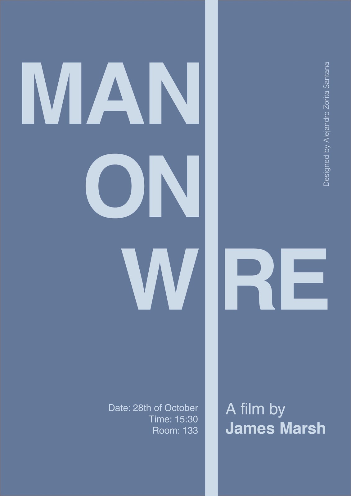
Based on the original poster I started to draw sketches on paper until I realised I could do a minimalist design of the concept following Vignelli's Canon and the use of grids.

I first designed the one on the left keeping the combination of lines and typography consistent. I stuck to Helvetica since is the typeface used for the original poster. Symmetry was the strength of this design, but I decided to make the silhouette of Phillipe organic (from a picture from above of a person walking) and imperfect so it gained importance. The colours I chose (using Pantone spectrum) were based on the main colours of the original poster, making an association of sky and concrete in two tones of blue. Although, I first thought of using the colours of the famous film poster Vertigo to provoke an association, but they were not appropiate to the nature of this film.

There is more text in the first design than on the second one as there also were more empty spaces that could be used for giving extra information about the film.


The second design is based on the first idea, keeping it even more minimalist and enhancing the power of typeface and basic shapes, letting them speak by themselves.

No comments:
Post a Comment