These are the shapes that has been considered for the design:


These are some of the typefaces (they are about 15 in total):


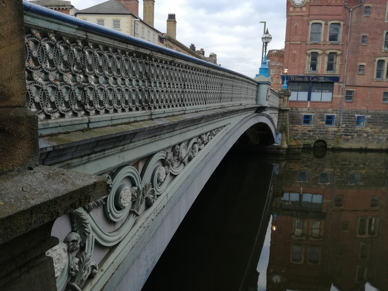
Portraying a victorian look would represent the time of Le Prince and the current bridge. Some of the downloaded shapes inspire delicacy, femininity, masculinity, etc. But in general they all are quite sophisticated, and for this purpose there needs to be a technological representation for the progress of the creation of cinematography.
After playing around with the elements, a draft was produced to make the onrmanets work together in such way that it praises the bridge and its event. It is hierarchised so it forms the structure of a movie poster - Louise Le Prince presents "Leeds Bridge". Filmed in 1888.

The Yorkshire white rose is also added in future developments to emphasise the relevance of the place. The design was put together properly with negative versions of it on a parchment texture, which enhances the vintage look. When screenprinted, this is going to be more noticeable and the way the ink lays on paper, with certain imperfections, will be very positive for the design.
The elements started to fall in place of the grid. This one was chosen as it seemed to be the one that tied up the elements in a similar way than the illustrations of the research. Also, a baseline grid that matched the regular grid was added for the text.

This process was done during easter so I needed a way to get feedback. It was posted in the Designers League, a Facebook group of designers which is very useful to receive feedback. This was a great idea since I got a lot of feedback from it.


Most of the designers seemed to agree that the negative design (the one on the left) had more presence than the one on the right. I wasn't sure about this, but after adding colours it became clear that when it's only about line it might feel a bit bare and weak.
When tried colours for the design the main idea was to use the colours from the bridge. I got feedback from others as well that the colour that worked best was the blue, as it created more contrast with the background. Also, if the blue is a bit pale it brings an even more plausible vintage feel to it.
Someone mentions in the comments of the post that the design looks like a wine label. It might be, but when it's printed as it is planned to be printed that relation should vanish.
Some pointed out the simplicity worked well. Ornamentation was something worrying. Over ornamentation can be a problem and victorian designs usually are very loaded, but it was good to know that this wasn't the case.
The image was then half-toned in, eventually, horizontal lines to give that handmade touch victorian illustrations usually have, as they are made out of lines.
When exposing the screen there was a problem. Due to an excess of photosensitive emulsion, one of the designs cracked and affected the text. But before making it again, I tried both designs to see if it was necessary. But since the negative one worked out better it wasn't eventually needed to make the process again.


When preparing the ink I mixed cyan, magenta, yellow and white to try to get the same as the CMYK indications on photoshop: 70, 46, 13, 0.


When printing the negative one, it became very clear that it was needed more ink than was initially planned. Also, the bottom part wasn't coming out very well because the screws of the structure were in the way. After moving the screen, that problem was sorted as it was possible to keep the same pressure throughout the screen.
For this prints the stock used was acquired in college, as they sell parchment like paper. It was somerset velvet antique as it is very similar to what I had in mind: an old looking paper with a yellow-ish colour and rough texture.
After making some tests on scrap paper and when the print started to come out properly I then started to use the somerset paper.
Some of the prints didn't come out perfectly, but it eventually worked out. The combination of blue ink over the yellow toned stock made a good contrast similar to the mock ups.
As it was expected from previous experiences, the ink wasn't applied evenly. This worked out very well with the general vintage look of the design. In another print it was used more ink to see which one worked best, and the one with less ink looks more appropriate to the general aesthetic.
At some point, when it was too late, I realised I was using a white screen instead of a yellow one. White screens are to print on clothes and that probably made me cncounter problems when applying the in. But it eventually worked out and it was very rewarding to have the staff of the print room and some peers congratulating me.
Design process: