In this post I am going to analyse two different magazines in order to demonstrate an awareness of figure and ground uses.
In this magazine I am showing below I can tell by the use of white space the design is to meet the expectations of those who are either designers or design lovers.
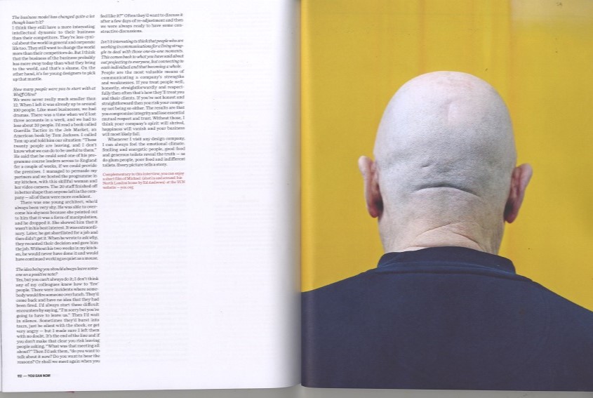
The presence of the number one on the right page and the air around given to it sets a new start in the magazine. The reader can easily feel the break, the full stop.

The power of the picture conquers reader's eyes by using 5/6 of the two pages layout to show the picture. The other 6th is just for a quote. This is a section where clearly images speak more than words, so why not giving them the importance they deserve.

The second magazine is Wired. In the first image the space in the photograph where is not occurring the main action is the white space, allowing the designer to add text on it. This results in a very light perception of text and a bold presence of the eruption.

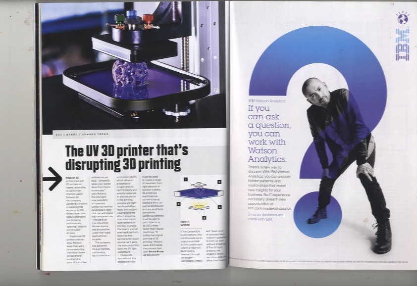
In the page of the right, where the IBM advert is, the two big figures (interrogation sign and the man) stand out from the flat background leaving space to the left that has been used to add some text. There is not much space in this image, which creates tension.
No comments:
Post a Comment