https://www.penguinrandomhouse.co.uk/about-us/design-award/adult-fiction-cover-award/
Brief specifications We would like you to design a new and classic cover for this book. The trick here will be to come at it from a fresh perspective and to avoid repeating the obvious iconography from the many previous editions in print. If you can get your hands on a copy of the book in order to get a sense of the beautiful writing, this will only help to inspire your design. The cover should feel timeless and confident, and appeal to a whole new generation of readers.
Your cover design needs to include all the cover copy supplied and be designed to the specified design template – B format, 198mm high x 129mm wide, spine width 20 mm, incorporating the ARROW branding and all additional elements such as the barcode
Research about what the book is about (wikipedia)
Key concepts: Southern life (Alabama)
Racial injustice
Social classes
courage and compassion
gender role
unwritten and written rules
death of innocence
1929 -1940 (Great Depression)
![Mary Ann Cotton: The West Auckland Borgia by [Connolly, Martin]](https://images-eu.ssl-images-amazon.com/images/I/61AuRv-nt9L.jpg)
Researched crime, thrillers and mystery books, but I think this one fits better into the category of society, politics and philosophy.
Also looked into great depression aesthetics in southern us
http://www.frumforum.com/wp-content/uploads/2012/01/great_depression-2.jpg
http://www.frumforum.com/wp-content/uploads/2012/01/Depression.jpg
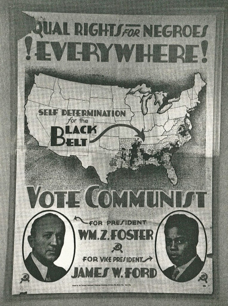


Also looked into how injustice could be graphically represented. This is a good example of injustice that can be extrapolated to some of the topics of the book. http://design.jeffcastle.org/students/main_uploads/ferguson.png
The design should represent the values and the time the story happens but from a contemporary point of view. A good example of this I found out as a Feedback is The Great Gatsby. There are some other designs in Art Deco that actually look from the time, but this film refined the typography and colours of the time.
http://www.chungkong.nl/wp-content/uploads/2013/12/No206-My-The-Great-Gatsby-minimal-movie-poster-720px.jpg
http://images.fineartamerica.com/images-medium-large-5/the-great-gatsby-book-cover-movie-poster-art-6-nishanth-gopinathan.jpg
http://cdn.collider.com/wp-content/uploads/great-gatsby-movie-teaser-poster.jpg
The difference between the two last pictures is that one is using the art deco typeface that was usually used in that time and the other one follows more contemporary rules, layouts and colour schemes.
These were the first approaches to the design. Using typeface based on the research previously mentioned and geometric shapes. The gavel is white to represent on which side the justice actually was in the story. The title in black, which is about to be smashed by the gavel. The red background is to raise awareness about this situation of unjustice.


There was more experimentation showing the gavel broken, representing the unjustice in our values and society. But the aesthetic in general wasn't convincing nor appealing.
The design was started from the scratch. The game Final Fantasy XV was going to be released initially in September. Although, the date was changed to November. This was a title I was waiting for and this change made me go through the old Final Fantasies to cool it down. It was when I came across the Final Fantasy VIII first animated sequence that when I saw the feathers I couldn't avoid but to relate it with innocence, and that triggered the idea of using feathers for To Kill A Mockingbird.
At first it was considered for the design to make a typeface similar to Black Swan, but the connotations weren't exactly what was intended to be communicated. For the title it was used Butler for "To Kill A" and Tangerine for "Mockingbird". There is an emphasis using the second typeface on the word "Mockingbird", which looks like it's been written with a feather. The text for the back cover is written with the typeface Tenderness, which is somehow like Garamond but more lighthearted and with connotations of innocence. Like in cold blood, the PhontPhreak's typeface was used for the review written by Truman Capote, which makes also a connection between the two books. The author's name is written in Butler bold, which maintains the essence of the research previously done. For the spine the intention was to use just te feather, as it is recognisable enough and, in case that the book is unknown, it'd encourage the audience to find out what book it is.


After the feedback session the others weren't too sure about using the feather on the spine, but after considering it, it is a competition brief and it should be more about originality and creativity rather than something purely methodical. The feathers were changed in the end as the ones in the previous examples were made using a free brush for photoshop, but it needs acknowledgement. To avoid problems, the design of the feather was remade using a public domain image. Another suggestion in the feedback session was to use the feather "hair" to draw the fence that is so important in the story. I though that using the tree would make it more recognisible. After a brief research, the tree in the story is an oak. For this purpose it was also used public domain content. The feather was adjusted to make it look more appropiate to the design, delicate and ephemeral. This design was also inspired by Final Fantasy famous logos made by Yoshitaka Amano.
At the beginning I was going to use just black and white to show the racial unjustice, but in the crits I become aware that everyone was doing it. So instead, the design is going to reinforce that sense of innocence with similar colours that were used in the logo for Final Fantasy XIII, which is in part a story of loss of innocence. The blue and green colour are perfect to divide the feather in two: the world of innocence, full of dreams and hopes, and the reality, in green, which makes the feather become grass.


The grid used is the same in both books, which was created to adapt everything to the content that already comes with the template. The text in the title was aligned to the heavy part of the M to keep it more balanced.


No comments:
Post a Comment