Genre: Crime
Touched topics: death penalty, two-faced justice, humanity behind a crime, motive, random disgrace
Key concepts: Holcomb, Kansas, 4 dead (perfect american dream family), it can happen to anyone, killed for nothing (they had no money), bound and gagged, slit throat + headshot, Killing to rob when victim had no cash, false tip, 2 killers - 4 dead in a Farm.
Events: http://whatliesbeyond.boards.net/thread/578/november-1959-clutter-family-murders
Inspiration
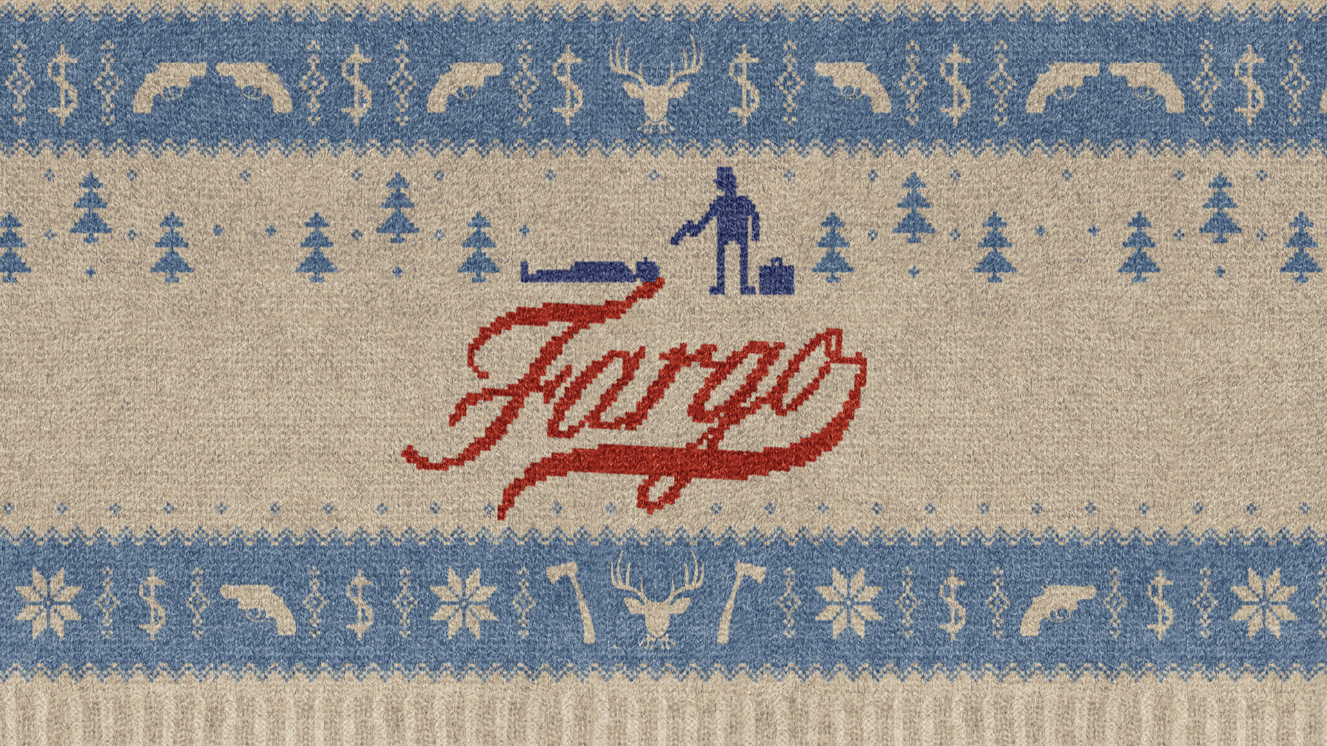
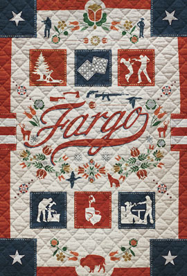
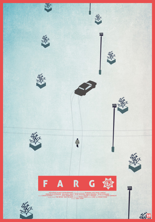
Fargo and fan art


Other concepts and ideas to consider for design:
Blue blood as a concept of cold blood
Lumberjack pattern, as it is a story about a crime that happened in a farm.
12-gauge Savage Model 300 (The shotgun model used in the murder)
More info about the crime: http://whatliesbeyond.boards.net/thread/578/november-1959-clutter-family-murders
Another fact that should be noted is that the iconic typeface Helvetica was designed in 1957 and the crimes took place in 1959. This doesn't mean that Helvetica should be used for this design, but a similar design with different connotations could do the work.


As its genre its crime, the design should imply that the events written on the book could happen to anyone. In the story is told that the victims were murdered with a shotgun while they were tied up. In fact, they were shot in the head, so the design will show the barrel of a shotgun pointing at the audience. Also, the two barrels of a shotgun could make the double 'O' of 'Blood'. When researching this shape, the smoke gave a new idea to enhance the title and make it stand out more.


The red letters surrounding the white barrel emphasises the rest of the title and it makes it look like everything around it is stained in blood. The design should have a strong use of typeface for having a chance to win the competition, as it is one of the most important considerations in it. The black background portrays the darkness, death and the loss of hope.
After trying several typefaces, the name of the author is shown with a monotype (Courier Prime) as it not only makes contrast with the bold title written in Oswald, but it also represents the nature of the author who was an investigator and in the 50's, which means he would probably used a typewriter as one of the main tools for his job. Oswald is a long shaped sans-serif typeface with sharp edges and its use is inspired on titles related to mafia, but less sophisticated, as the murderers weren't part of an american organised crime group and the connotations (like luxury) are different. PhontPhreak's Handwriting is the typeface that was eventually used for the quote on the front, which is a review. As it is an opinion, to give it a more personal touch, several handwritten typefaces were tried but the one who looked less ornamented and more natural was PhontPhreak's.


These were the first designs presented to the peers for feedback.


Questions were about if the concept was identifiable or not, which of the different designs worked better, if the typeface was appropriate. Most of the comments were very positive towards the design, labelling it of bold, pleasant and eye-catching. There were a couple of suggestions to make the name of the author more visible by changing the typeface or the size.
Someone also suggested that, since this is a competition brief, there was more room for creativity. That I could use empty space to hide something with, for instance, hydrophobic ink or something similar. Despite being a very intriguing and interesting idea, it's hard to say how a design that aims to fit into the 40's aesthetics can have that kind of sophistication in terms of police investigation methods.

In another Feedback session the final full design was used to identify if the concept was successful and what could be done to improve it.

The answers pointed the subtlety of the design but also the effectiveness, simple but strong visuals, which lead the eye and makes the audience think. Others admit to be caught from the distance and being involved in a sense of mystery and intrigue. Someone pointed out that maybe the monotype for the author's name is not the most appropriate for the theme, which I cannot agree with precisely for the reasons explained earlier. Also, the other designs were shown to see if the cover needed to be changed, but the majority agreed this was the cover that should be used.
Making the barrel in 3D was an interesting suggestion that I tried to carry out, but didn't find a way to make it work and my experience using 3D design for purposes like this is not very positive. But the comments about the actual design were, which was really surprising as I thought it was going to be more critisised for being too simple.
No comments:
Post a Comment