We realised that most of the photographs they use for the website have warm colours (from yellow to red). In general, their places feel cosy, welcoming and relaxed. Also, they use a very friendly, common and humorous tone of voice. They have named some of their meals and places with hilarious and cheeky names, such as Prawnography, It's always sunny in Lewisham or German sex dungeon.
The website has a retro but clean design that reminds of old cinemas as well as the divided layout. Some of the typeface is chunky, which creates a humorous and relaxed vibe that's very easy to relate to. They only use sans-serif and most of it it's in capital letters.


Since they mentioned they want to make this festival in summer and they are proud of their tikis, it became a bit obvious that they might be looking for something tropical. Since their look is quite retro, we looked for designs with Cuban or Tropical retro vibe.

This is a design that represents an jazz, fun, and informality. The typefaces of "Miles" is jumpy but very readable. Everything feels in motion and exciting.


We also looked for something more contemporary with a similar feel. Solid colours as a background, typography interacting with the photograph and an old car with Swiss design makes a combination that can be more interesting for contemporary audiences.


Typographic treatments could also be a good choice to represent that "jumpiness" and excitement without relying too much on illustration or photography.


We agreed that, in order to be recognisible and make the four sites associated with the street feast, there should be a limited colour palette.


These are some examples of limited colour palettes for festivals that take place during the night. The colours seem to represent the lights of festivity.
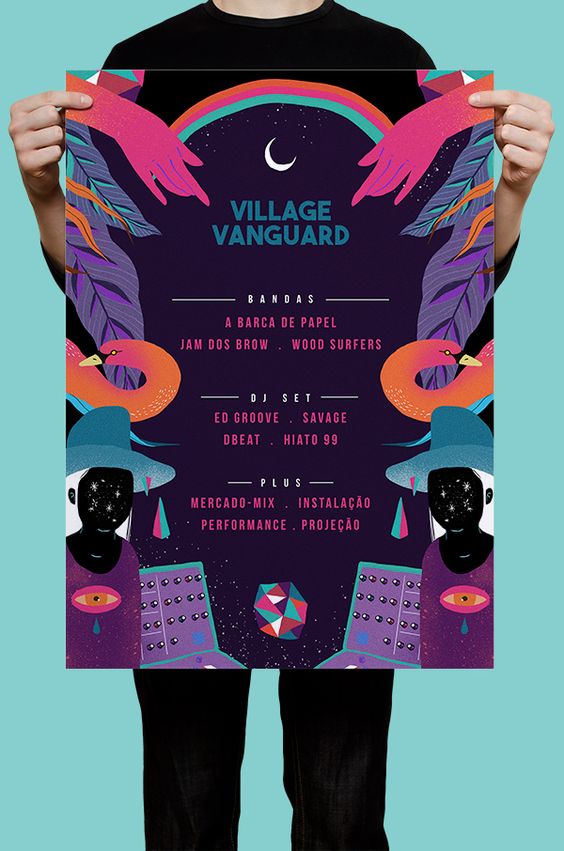


Hannah has the skill to illustrate something for the design if needed. That's why we also looked into different types of simple illustrations that can add the touch of distinction to the designs.


In food festivals - and in festivals in general - there seems to be a constant in what needs to be designed: posters. We wanted to do something else and expand it as much as possible, so we looked into advanced festival projects and realised that many things we cannot design for time restrictions, but we could mock them up, such as customised cups, fences, etc.
A highlighted project amongst all the ones we checkd is the Comedy feast designed by Only. What it's worth highlighting about this project is the use of a motiv throughout all the designs (the wobbly line), limited colour palette, chunky sans-serif typeface, posters with pictures and typography based and a clear message: laugh, food, and fun.


These books were also considered for the design of the posters.

No comments:
Post a Comment