The idea that was going to be developed was making illustrations of existing photographs of female athletes out of words that are related to them and encourage younger generations to use as references.
These are some examples:
Male cheerleader (holding up something, like a ceiling)
Female basketball player dunking in some high edge (Brittney Griner) Her look can appeal to younger audiences. She is also into feminism and equality


Female boxer (Amaiya Zafar next to the school bell. waves from the bell to her)

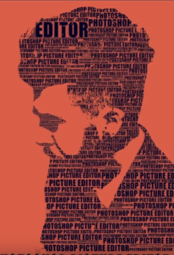
Male Figure skating (lines across the floor with Javier Fernandez jumping pasted on a wall)


Some inspirational images designed by others:


After a while, I thought that the best idea was probably to use only women to stick to the main purpose of the research. Also, using the technique of stenciled words with the athlete in action results in not showing the face properly.
There are different techniques for this. Some research and testings was needed to find out which one was the most appropriate


As it can be seen in this test, if the picture is not a close up the details in the face are lost, which makes a famous female athlete look like any other. To make this effect the chosen font is Bebas, as it has connotations of passion and sport.

All these tutorials used Photoshop for their techniques. I tried to find a way to make it on illustrator as the size is going to be quite big, but most of these designs rely on the use of layer masks. So I tried to work on the biggest size I possibly could, which eventually was 75x75 cm and making sure the smallest text didn't pixelate. Although, this designs can be used later on in Illustrator to recreate them in vectors, but tracing it is not a possible avenue, as it distorts the text.
I produced 2 different illustrations to take them to the crits. I also played around with colours and layouts to add the name. The colours for Brittney Griner are the ones of the team she plays in (Phoenix Mercury). For Amaiya Zafar, the boxer, colours like white, black and red are very representative of boxing.


For Brittney Griner I used the word strenght not only because she is a very physical and strong player, but also because of one of her famous quotes:
"I am a strong, black, lesbian woman. Every time I say it, I feel so much better".
The word "Strength" is bigger at her fist: she shows proud for her strength but also holds it as she is in control of it.
In regards to Amaiya, the word faith represents both her attitude towards boxing, believing in herself and also believing that she can change the regulation towards clothes, as this olympic discipline haven't considered that a woman with a hijab can also be a boxer. She's a game changer and she deserves to be praised for it. The word faith it's bigger at her chest, as it's close to her heart, and her arms since she is a boxer.
The main idea to produce this was to divide the illustration in A4 papers to stencil them out, organising them and then spraying paint on a wall. The interaction came when the kids playing would be encouraged to tear the papers off, revealing the image and keeping the positive words as a message. But this lacks of purpose and it's probably not entirely feasible considering the size these illustrations are going to be.
As it was pointed out in previous feedback sessions and in the final one, the best way to encourage interactivity is maybe by using social media. A very good idea would be to release an app or add a feature to an existing one that could make an illustration out of a photography with a chosen word. This could be done by giving simple instructions like, for instance, making sure that the picture taken has a white background. To ease the process of making the app and to avoid a misuse of it, the words might be limited and offered to the user as a choice. Also, I was concerned about not producing any physical work, but Simon Jones said that mock ups were fine.
The typeface of the name was changed to something that looked handwritten as it gives a more personal touch, like if that person was there once which, in a way, they were.
Before adding any text, the illustrations are imported to InDesign to apply a grid and put the text in its place.


Mock ups:


The number of illustrations made for this purpose can be very high. But to clearly show what is intended with this project one more illustration is needed. This is to provide enough evidence where a pattern can be perceived.
I decided to use Serena Williams because she is a very inspirational female athlete and a reference to many other athletes. Tennis balls colours is what informs the colour of the text and purple for Serena, as it is a symbol of feminism as well as the complementary colour of lime green.


No comments:
Post a Comment