This week we have been asigned to develop a symbol for the YSP (Yorkshire Sculpture Park). In order to being able to do it we visited the park to do a primary research so we could also get inspiration from the main source. Even though, before our visit I checked different park logos on internet and the YSP website so I could enjoy the visit with a little bit of preparation.
During our time in the park I visited as much as I could, taking photographs of every exposed piece of work from different angles, so I could use it later on for the design development. At some point, I realised that everywhere there was a tree, there were leafs (Autumn season might have something to do with that), but they were mostly from the same kind of tree. I am not an expert in trees myself, so I decided to take a photograph of that type of leaf, which could be a symbol of that park.

But I was not quite happy with just doing a leaf for the symbol, since it is supposed to represent a sculpture park, not any park. It was then when I started to think how to embed an sculpture in that leaf shape. Looking at the picture, I visualised the shape of a face on the right side of the leaf (prominent eyebrows, a not so prominent nose and a chin) so I focused on human shaped sculptures photographing, over all, the faces from a side and making sure they were permanent. This shape was the one I most liked being at the park.

Designed by Henry Moore the Draped Seated Woman in 1957-58 made me think she could be the symbol of the park with her polygonal face taken from another world but conveying an eternal but pleasant waiting looking at the lake. I liked the idea of using a face of fantasy to make the audience link the visit to the park with a dreamy experience. I used Adobe Illustrator and the pen tool to contour the shapes. Sadly, it did not work quite well with the leaf idea, as the face has too sharpen edges while the leaf has a more natural ones. The contrast was too big and I did not really like the deformation look it eventually took.


The shape did not have
the consinstency I thought it was going to have and doing modifications
it was loosing either the leaf shape or the sculpture one, but as I was working against the clock I decided to go for a more natural shape and see if I could make it work. After checking all the faces I photographed, this was the one I thought it could work better: Riace III by Elisabeth Frink (1986-89). This was also a permanent sculpture and it is at the entrance of the park.
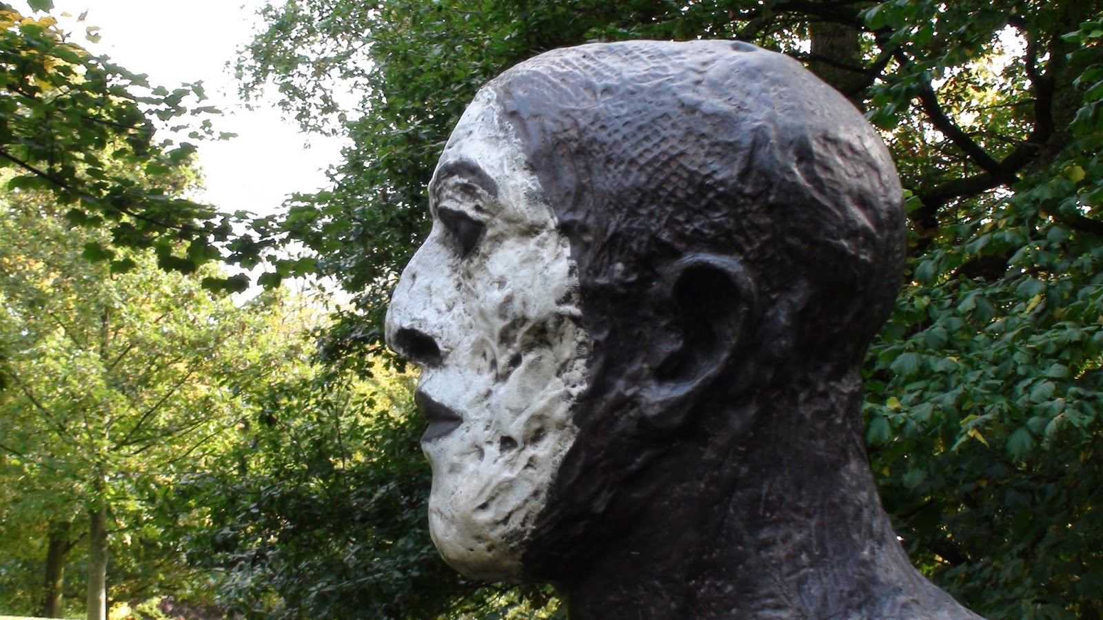
But before including this new shape to the existing leaf, I decided to make a more simplistic leaf design and then add the face silhouette to it. The result was a more pleasant and fluent design representing what I wanted at the beginning, and not just the nature and the sculptures, but also a communion between human and nature, art and purity. In order to enforce that idea I added a green and white gradient: green for nature and white for purity. I also used the green to make the face more solid while the leaf looks more delicate with more white.

I also realised with this outcome that I could use the negative space much better. There was a component that was not in the symbol yet, and it was Yorkshire. So I decided to make a "Y" with the negative space that draws the main vain of the leaf. I also reduced the nose hole as it was unbalancing the image taking too much eye attention and add a stroke around the mouth to make it look closed like in the original sculpture, as in the previous drafts it looks like it is open.

I really enjoyed this task over all in terms of how being in the place that is going to have your design helps you to come with a solution to the problem firstly set. Before going to the park I was thinking of using a tree for the symbol, but without the visit I could not have come up with the leaf idea, not to mention the lack of photographs and material I would have without using the camera in situ. It is also the first time I use negative space in a design, so I hope that awareness becomes now a habit as a good use of negative space can shift a design from being good to be excellent.
No comments:
Post a Comment