The book is going to follow a simple structure. An introduction to place the reader within a context and the images to be viewed. The photographs are going to be displayed in full bleed, so the reader can better picture how it is to be there. Photographs with a frame are probably not the best answer for this purpose.
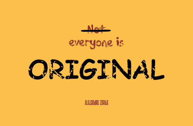
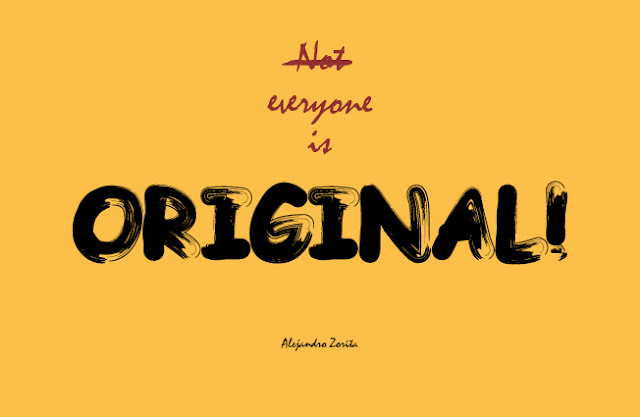
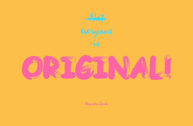
The only typeface to be considered in the book is the one used for the introduction and the cover of the book. After trying different typefaces like Times, Helvetica, Garamond or Century Gothic the text looks more impersonal, like a voice over, in Garamond. For the cover, original is the main word, so it needs to be seen. The use of Comic Sans can be also a good idea, as it is the yuxtaposition of the word original with the history of the typeface. And since this publication is about typeface, the context is consistent with the use of this controversial typeface. Also, the overused design of "Keep calm and..." was considered for the cover, but it would have blended in instead of standing out. Along side of Comic Sans, Mistral seemed to be a good combination because of its similarity of relaxed styles and the contrast of being sans-serif.
The book was supposed to be named "Everyone is original", but adding the "not" crossed at the beginning would point out the juxtaposition of the different understandings of originality.
Before deciding what colour was going to use for the design, the design went through several combinations to see what was the best choice as well as adding more elements (or not) to the cover.
The grid system used is based on the Vignelli canon, but of course customised for the size of the publication, which is 230mmx150mm (an octavo). The baseline grid, used for blocks of text, has a separation of 5mm. The margins are 10 mm from the borders and there is a 3mm bleed area. This was calculated after failing in trying to fit a baseline grid within the guides without keeping in mind the proportions between these. The grid is 9x9 with a gutter of 5mm, like the baseline grid. This ensures the layout will rest in harmony with the baseline grid.
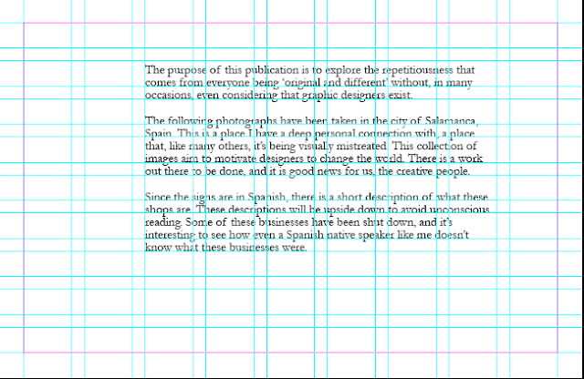
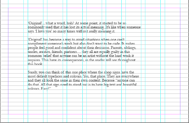
The font size is also affected by this math. Being 5mm for body text, 10 for titles, and so on.
When looking into psychology of colours to identify which one could work better for the book cover, yellow is a colour that conveys a critical mindset. In Empower Yourself With Colour Psychology they described it as: "Yellow has a tendency to make you more mentally analytical and critical - this includes being self critical as well as critical of others".
It was a bit overwhelming to see how many of these materials and posibilities there are for a book cover. After looking into several materials for the book cover and due to the nature of this publication, the outside shouldn't be over-designed or the content might seem disappointing. The printroom staff also helped to identify the material needed for this publication. It was collected at Vernon Street.
Once the material was collected and tested, the Pantone book was useful to identify the colour of the material. This combined with colour combination theory and the app Coolors was a great way to quickly test different colours and find the look that worked best.

There is also a copy of the title in black and white at the beginning of the book in case the book cover gets deteriorated with the time.
The book cover is going to be produced using screenprint as it is a method that printroom staff has confirmed that works on this surface and can replicate exactly what's in the in design file.
In order to stick to that 'protest' style, the cover can be laser-cut to create an stencil and spray on it. This would give to it a graffiti look, which is also related to protest. Unfortunately, this idea arrives late, as the earliest induction available is the 9th of November, days after the deadline.
To solve this problem, the cover will be screenprinted with an effect of something done manually. Different effects were tried as well as other typeface combinations. Some of these fonts are Tajamuka Script, Acki Preschool and Triac 71.
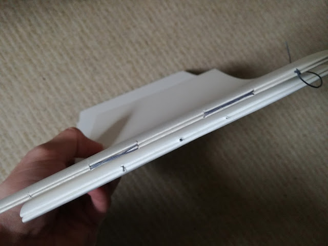
Initially, the book was going to have 3 signatures. But the number of the final pages makes them fit better in two signatures. The center of those two signatures is going to be used for the pictures that use two pages, so they can be fully viewed.
The position of the signs within the grid are based on two principles: trying to keep a symmetry on both sides and trying to follow the rule of the thirds to know where the signs should be displayed. This is so the eye focuses on the shop signs instead of anything else.

At this point in time, the designed seems quite dull and primitive. Different stocks from G.F Smith were considered at this time to be added in the book, like Ridged or Weizen paper (not available online in sizes bigger than A4). The design could be richer, and this concern was taken to Simon Jones, who believed that there was starting to be a tendency to overdesign this book, which would have a negative impact in the final outcome as the design itself would be the main protagonist.
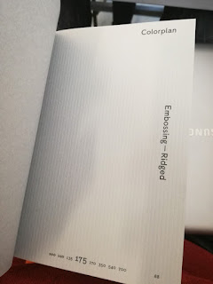
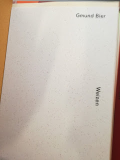
So in order to avoid this, the application of different stocks were limited to the beginning and the end of the book, where the signatures need to be glued to the covers.
Once the images were ready to be printed, they were adjusted following the procedure taught in the indesign inductions, where the images are in CMYK (manually adjusting the colours to avoid Photoshop misinterpretations), size adjustment and conversion from 72 to 300 ppi.
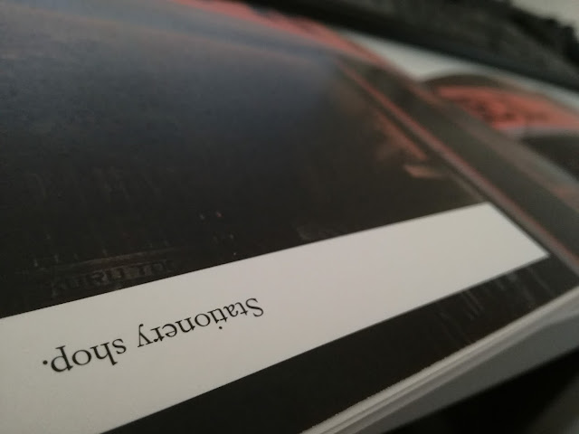
Few hours before printing the last mock up, as a rushed idea there were added white boxes for text that reveals what the shop sign is about, but they were upside down, so the reader would have to turn it around to read it and to avoid unconscious automatic reading. This was to make the book more interesting, since what was happening is that the book wasn't interesting for trying to make the pictures look repetitive and boring. This two concepts need to be separated: the book needs to be interesting, but not the pictures.
Different tests were printed on matte (200 and 120 gsm) and glossy (115 gsm) white stock. This helped to identify what stock was the most appropriate for the publication. The matte 200gsm was perfect to convey the conservative and rough look Salamanca has.
Also, the printroom staff helped once again identifying the best binding method for two signatures.


No comments:
Post a Comment