Before jumping onto the computer I had to make a list of the courses and assign a colour to them. I used the colours provided in the PDF of Leeds College of Art identity guidance: Fashion (P.3385), Graphic Design (P.Yellow), Fine Art (P. 7419), Photography (P. 3135), Creative Advertisement (P.254), Illustration (P.1505), Visual Communication (P.5205). Having only 15 colours to pick from, I picked the ones that can create more contrast with the surfaces in the building for the courses, as, despite the building is used by student and workers, the main target audience are students.
At the beginning P 213 (Pink) was going to be for Graphic Design, but a design decision that will be explained later on made me change it for P. Yellow. P213 was the one used for signage using a mosaic, since it is the colour used for the mosaic on the website, which is the main colour for the logotype.
At the beginning P 213 (Pink) was going to be for Graphic Design, but a design decision that will be explained later on made me change it for P. Yellow. P213 was the one used for signage using a mosaic, since it is the colour used for the mosaic on the website, which is the main colour for the logotype.
After having a chat with Simon about the work I've done so far, I was wondering how I could represent something like Graphic Design with a pictogram. He told that if I cannot think in a way of doing it, it's probably because there is no way. And if I design something for that, it won't be recognisable. At this point I decided not to use pictograms for courses, but just colours. Pictograms would be just for amenities and facilities.
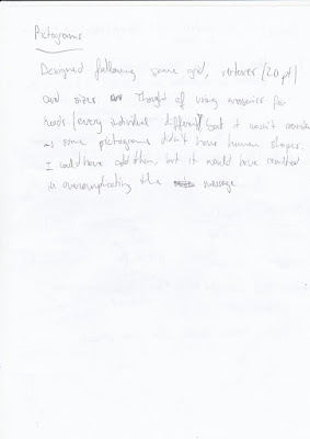
During the process of designing them, I considered using persons with mosaics as heads to make the audience associate the users of the building as unique individuals. It was not only over complicating the message, but also some pictograms became difficult to understand. Therefore, not using persons for pictograms was the most efficient conclusion.

I designed the toilet pictogram trying to stay far from the usual design to avoid unnecessary sexist connotations. Instead, I made man and woman exactly the same, but the woman has rounded shoulders, as round shapes are related to women while straigh ones are to men. Although, it's interesting to highlight that I had to leave the man first, because putting him in the middle could create confusion, as it always come first.
At this point in time, some mock ups were made to check how the process was coming up.
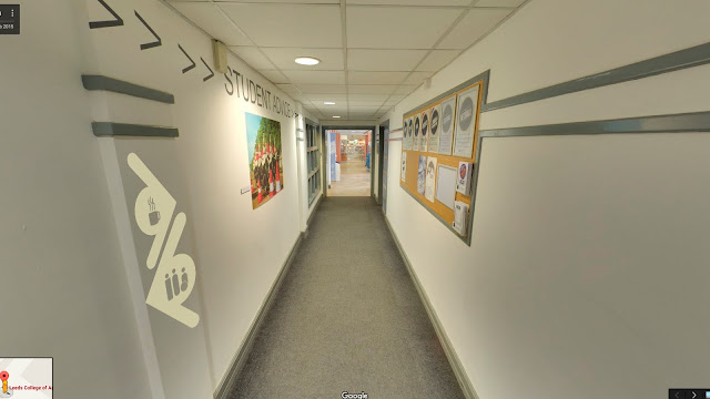
The idea of following the pictograms i not very effective in the real world. Too much space is needed, it wouldn't be efficient in terms of printing or modifications and it isn't very sophisticated either. They looked too weak and forceless. Using the celing wasn't an option either, as there are many different types. As well as the floor, which is sometimes rug and sometimes concrete.
The arrows were visible enough and they have a clean aspect. Pictograms were visible in circles. After experimenting with different arrows this was the most effective outcome, as it saved space placing the circle in the space created by the two strokes.
The addition of the man/woman shape occupying the majority of the door is to easy identify where the toilets are, as many doors in the building are grey and toilets are usually hidden behind pillars.
The addition of the man/woman shape occupying the majority of the door is to easy identify where the toilets are, as many doors in the building are grey and toilets are usually hidden behind pillars.

After tossing the mosaics idea I realised that I had to rely more on the arrows. To do this, I made them thicker, so with the circle inside it would look like one single piece.
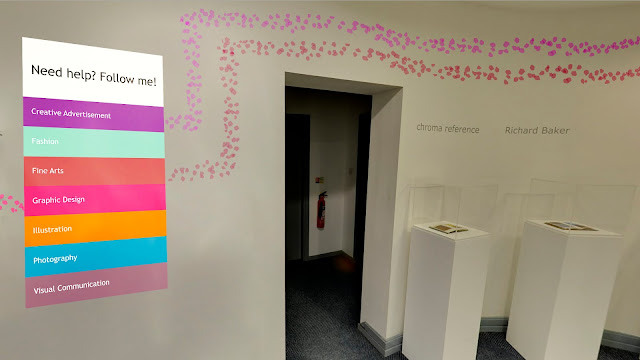
Using lights of a particular colour to designate the area of a course (which have an assigned colour) was not only effective because that colour covers everything around that particular place, making it easy to understand, but also made the experience of following signage interesting. Lights can add certain moods and aura to an area, and this aura can have a meaning related to a course.
Using lights of a particular colour to designate the area of a course (which have an assigned colour) was not only effective because that colour covers everything around that particular place, making it easy to understand, but also made the experience of following signage interesting. Lights can add certain moods and aura to an area, and this aura can have a meaning related to a course.
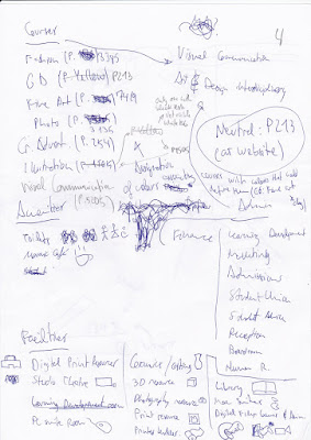
More experimentation with arrows and a list of all the installations in the building and their locations.
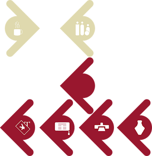
Using simple arrows with colours and a little text within it should be enough to indicate where a course is. But in order to use the same shapes in different ways, colours had to be applied. I used spare colours from the PDF of brand guidance: Amenities (P 5855), Facilities (P 202) and Offices (Black).
After some more annotations and experimentation, another mock up was made with the new elements. I also brought the mosaic that was going to be used for the floor of the blue stairs to put it on the wall.
The pink mosaic with the floor number in it quite big (so it's visible from the distance in case someone is looking for this information) has the content divided in two: courses and others. I also made 2 categories because courses are the important ones for students, and the rest don't necessarily need individual categories: it would over complicate the design and might create confusion.
The content has to be re-organised so courses will be in alphabetical order and others will be organised by first facilities, second offices, administration or other rooms and finally amenities.
The pictograms in the arrows in the mosaic should be separated from the arrows and make them bigger for an easier recognition. Increasing the space between lines should allow to make pictograms bigger.
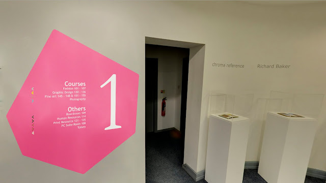

Leaving just an arrow for the courses would create confusion and it would be very frustrating for color blind people, so an addition of some text where the circle is in the others should help with the identification.
This approach is clearer and more aesthetic than the first one. Although, it has some problems like visibility from certain angles of the corridor and the signage of each floor doesn't say what's on the other floors. I took these questions to the Feedback sessions, and I got very useful suggestions.
One of them was to add small mosaics above and below the big one that shown what is on the other floors. In that way the big pink pictogram would be easily recognisable as the pictogram of that particular floor while the other information would be also displayed. Black might be a good choice for the colour of these little ones, that can't be too small, or legibility would be a problem.
One of them was to add small mosaics above and below the big one that shown what is on the other floors. In that way the big pink pictogram would be easily recognisable as the pictogram of that particular floor while the other information would be also displayed. Black might be a good choice for the colour of these little ones, that can't be too small, or legibility would be a problem.
Making the arrows in 3D, coming out a bit from the wall, was another suggestion that could make them visible from certain blind spots in the corridors. Also painting the doors of certain colours might improve the way-finding experience.






No comments:
Post a Comment