I remember that by then I felt a little bit frustrated working in a group task. I had the feeling that others in my group then weren't paying attention when I was speaking or my ideas went unnoticed. At some point, it made me realise that I was paying too much attention to what I had to say instead of trying to be more flexible with others.
Surprisingly, at this point in time, and in the middle of a group brief, I still thinking about this. Sometimes I still that I have the feeling of not being listened, but I changed my reaction: when the others ignore what I have to say or they just simply want to go for a design decision, I try to make the best out of it. It is very important to listen to others and avoid thinking that you have the right answer for something. Unless you stop and think about others ideas you can't completely understand it and, therefore, you can't know how good it can possibly be.
Besides, not long ago I learned a word that I didn't know before in English, which is 'to hark'. It's a synonym of 'to listen', more like 'pay attention', and I really liked it and it made me think about a connection with a very common concept in Graphic Design: CMYK, since it has 4 letters and the letter K matches in the acronym and the word. Mixing this 4 colours you can have any other, and this is applicable to what I want to convey: mixing your mind with others is much more powerful than working by itself and always thinking in one colour.
I was thinking in a way to make everything work together to create a word. First I thought about creating amorphous shapes for the inks that mixed created, in black, the word HARK. After doing some sketches, I wasn't convinced by this idea. Then I tried something simpler: 4 vertical lines with a letter in each one, but it was missing something too.

Then I thought about what else in the course created an unforgettable impression in my mind and I saw on my desk "The Vignelli Canon". I started to leaf through it and then I saw the Knoll's logo, something that always impressed me. Moreover, the concept can really convey what I was looking for: the results of working together. And something I haven't noticed before: Vignelli used CMYK for the logo too. Maybe he was thinking in a similar concept?
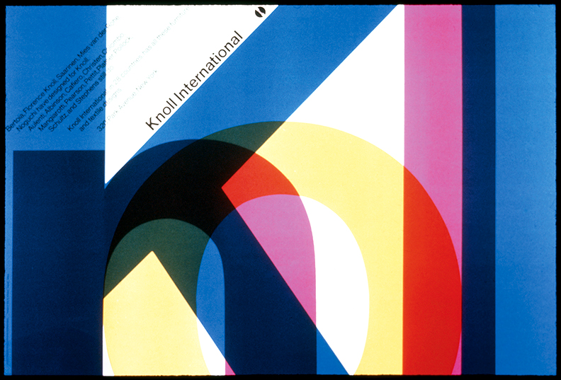
I didn't want to do exactly the same, though. And even if I wanted, it is not applicable to what I am looking for. Transparencies can overcomplicate the message I was trying to convey. So instead of using that, I modified the letters so they could construct the word mixing with each other, like in this other concept of Vignelli's.
This was the result:

I think the design it's appropriate, but it probably needs more details or depth. I left it there and see what else I could come up with to complement it.
No comments:
Post a Comment