We have our first meeting as a group. We make a group chat on facebook and we leave our college e-mails in case they are needed. After some discussion and brainstorming where I try to come up with a word made up of currency symbols. So I write down the symbols I'm able to find and start playing around with them, but an absence of vowels makes it a problem to deal with: $ € £ ¥ ₡ ₱ ₩ ₭ ₮ ƒ ₦ ฿ ₴ ₫
Nonetheless, I drawed a number 5 (the group number) and added to it the two vertical lines as a symbol or name for the group, but the idea wasn't much liked by the others of the group.
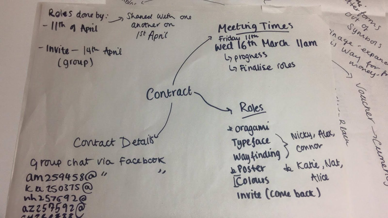
As I'm assigned to research typefaces with Nicky and Connor, I made a list of my findings.
In this meeting two ideas came up: origami with money and the concept "money can be fun", which I contributed with. I proposed to make a minimalistic concept about how money can be fun, showing a fun origami made out with money (many things can be done with the queen's face) and a simple catchphrase below it.
11/03/16 (Online meeting) 7PM
We discuss a concept that Nicky brings in based on 60's spies, having secret invites and gadgets in the exhibition.
I add that the exhibition could be designed like a vault, like the secret part of a bank and if the concept is successful, we could be dressed in suits, like proper bankers for the opening night.
This could be done by projecting lasers. Others added ideas to use invisible ink for the invites that can be seen through UV lights, find a use for bar codes. Make it look like 007.
At this point in time we agree that the target audience has to be designers and studios or people interested in design or cultural events.
Following images were added by another member of the group as a visual research for the spy theme.


- Before finishing the meeting, I reminded that we needed to justify the concept, which is over the practical work. We don't need to produce anything yet, so we need a strong concept to work on.
16/03/16 11AM
Concept development and work distribution.

This meeting was useful to catch up with the things that needed to be designed. But first, we wanted to explore a range of ideas before going down just one road.
We all had to come up with a different theme and explore it. Mine, was the funeral of money.
19/03/16 7PM Online meeting
Alice explains her ideas about a concept that involves the tabletop game Monopoly and her visual research were great. I really thought this concept has potential because it involves money and having fun with it.
30/03/16 Online meeting
I explain my concept. I tried to isolate keywords to identify what needs to be designed or in what context. Words like: Goodbye, money / Money is dead / Farewell Money / Funeral of money
And also things that are usually in funerals, like coffins, stone tablets, a picture of a fiver with flowers around or just flowers next to bank notes.
Something like this with a picture in the centre
- Organise the exhibition in a way that the coffin or whatever it is going to be the main attraction is at the bottom of the room. So people follow a queue, like in funerals, when they go to visit the dead body for the last time (very poetic).
At some point in the exhibition, maybe do a little performance, like having a group carrying the coffin outside or someone saying some words. That will call people's attention and entertain them. Maybe there's something that can be done easier, like covering the coffin with a courtain and opening it after calling people's attention.
Katie added that it would be funny to have a book like in funerals, where people write nice things about the person which is usually on a table, as like the feedback book. I thought this could be a very good idea, having some stuff already written down, like 'I will never forget those shoes I bought with a tener'. This could work with Twitter as well, encouraging people to leave something written there with a hashtag like #farewellmoney. - I went a bit far with this, with an idea that might be prohibited to do, but I wanted to see where the limits are. Having a little box of cremation (which basically would be some controlled fire) so people can throw in false bank notes. Didn't think it was doable, but it could evolve in something else.
To make it look like something actually fun and not creepy, I thought it could be a good idea to use pastel colours instead of dark traditional colours like in funerals. I thought about something like the music video of Jack, by Breach. They convey fun feelings.
- The others in the group seemed to like this idea. We all just needed to hear everyone's concept to make a decision.
31/03 - 4/4/16 - Nicky explains his concept about a future where money stills alive, giving to it a spaceship-esque atmosphere. Also the use of stereotypical futuristic materials, like glass or chrome.
- I suggested that we could make things simpler, creating shapes with lights and neon colours.
He also presents the typeface Sevastapol, which better represented what he had in mind: that it links to traditional money type and retro-futurism.


6/4/16 Online meeting 19PM
With the explained concepts we needed to vote and see what concept deserved to be taken further. I voted for the monopoly concept because I thought it had potential with the connection between money and fun. But at least 3 of them wanted to do the futuristic approach, so we moved on with Nicky's idea.
I suggested at this point in time that could be a better idea to put more effort in explaining the concept and justify it with the exhibition instead of looking for some typefaces, colours or design decisions we might trash in the future due to possible and probable changes.
There was a concern about the variety of the notes. I suggested to design an exhibition like it is happening in the future, exhibiting the bank notes like something our ancestors used to use, like something primitive. Like something one sees in a normal museum of mummies or primitive tools, but giving to it a touch of extravagance, an oddity that our ancestors wanted to use for some reason we don't understand as people from the future.
Someone else mentioned to do a timeline of the past and future instead, so it follows around the room as a reflection of the history and what's to come.
12/4/16 12PM
We had a meeting to discuss what was doing what in this new concept. I was assigned to design a promo for social media. So I made two different mock ups, because I didn't really know what way to go with the concept, because it wasn't very defined at this stage:


First I made a design with a 80's-90's vision of the future and using the typeface Nicky found. But thinking about it further, I thought the concept could be stronger if we somehow mixed it with something related to printing.
Then I started to do some research and I found this kind of printouts in a fax fashion that really brought me old memories from the first home printers. I explained to my group that it would be nice to have something like this because it is really something that grabs the attention nowadays, but at the same time try to add some creativity to it to get rid of the 'office feel'. Maybe draw a bank note with a pen, like creativity can come from the most unexpected place.


12/4/16 9AM
Natasha, the other one in charge of designing for social media, came up with hashtags for social media. Also, the uses of Twitter, Facebook and Instagram for updates, pictures of making of, etc. Also, to find local pages relevant to Leeds and advertising Leeds to give the exhibition more exposure. She also came up with a logo with a hashtag to be shared.


13/4/16 12AM
The meeting was to show progression and to see what needed to be clarified. I mentioned again the importance of justifying the concept with the actual exhibition.
I explained a relation I found for it, saying that in the 80's society used to think that by now we'd be using flying cars and other crazy inventions were taken for granted. The same might be happening with money now, like we think it is going to disappear but we might be wrong, as it still useful. For instance, children cannot use an app or a credit card to pay. So we want to bring back that excitement of imagining an incredible future, something I remember that happened very much in the 90's.
Nicky agreed with my reflection, so I thought it would be a good idea to take it to the presentation.
I also had an idea for Katie, who was working for the wayfinding designs, to make stairs with the typeface.


14/4/16 2PM and online meeting in the evening
Connor sent his design for the poster, much more digital than my proposal, but it was very welcome in the group. Same as Katie wayfinding lines with information, which I found very minimalistic and appropriate.


We talked about the content in the presentation and Nicky said that he could create it. I would have loved to help, but that day was hectic to me, as I was dealing with some problems with the screen printing that took me the whole day. Nevertheless, I told him to tell me if he needed anything and I sent him the mock-ups I've been doing the last days.
15/04/16 Presentation
We had a little meeting before the presentation to refine some details and make sure everything was ready to be presented.
After the presentation, we've got some very useful feedback. I am going to focus on the negative points that need to be improved:
- How is the timeline going to work with timeless concepts? (E.G: A bank note from hell or other galaxy).
- Make the concept look like Broker Exchange aesthetics.
- Make sure the theme of the exhibition doesn't become the main attraction of the exhibition. It has to be a background of what's being exhibited. So music and other elements can distract.
- We didn't talk about target audience and how the bank notes are going to be displayed.
Concept Update
I did some visual research about the Stock Exchange visuals to see if our original concept can evolve in something money related.


Last time we discussed, we thought about creating fake monitors to be set around the room and place inside each design, meeting with a stock exchange visuals. Otherwise, if this is considered that distracts too much the attention from the exhibition. Also, using the centre of the stock exchange room idea to cover the air conditioner.
Just made a quick mock up. Nothing brilliant, but more to try to make the team engage with the concept updating.

The opinion of a couple of them was that the typeface for the exhibition name was too playful. I agree, but I was looking to remove some seriousness.

Using Nicky's typeface it looks a bit like a videogame. Also tried with another one.

They preferred the use of Nicky's typeface, as the last one looked like a clock.
We had a little meeting before the presentation to refine some details and make sure everything was ready to be presented.
After the presentation, we've got some very useful feedback. I am going to focus on the negative points that need to be improved:
- How is the timeline going to work with timeless concepts? (E.G: A bank note from hell or other galaxy).
- Make the concept look like Broker Exchange aesthetics.
- Make sure the theme of the exhibition doesn't become the main attraction of the exhibition. It has to be a background of what's being exhibited. So music and other elements can distract.
- We didn't talk about target audience and how the bank notes are going to be displayed.
Concept Update
I did some visual research about the Stock Exchange visuals to see if our original concept can evolve in something money related.
Last time we discussed, we thought about creating fake monitors to be set around the room and place inside each design, meeting with a stock exchange visuals. Otherwise, if this is considered that distracts too much the attention from the exhibition. Also, using the centre of the stock exchange room idea to cover the air conditioner.
Just made a quick mock up. Nothing brilliant, but more to try to make the team engage with the concept updating.

The opinion of a couple of them was that the typeface for the exhibition name was too playful. I agree, but I was looking to remove some seriousness.

Using Nicky's typeface it looks a bit like a videogame. Also tried with another one.

They preferred the use of Nicky's typeface, as the last one looked like a clock.
No comments:
Post a Comment