The obvious response to me was to represent a dead flower, like an old rose with dark petals.

To identify the ambiguous approach the concept was broke down. Dead flowers could mean end of hope, end of love. Feelings related to sadness, tireness of life, crying.
First I thought about the feeling someone has of nothing to live for, a meaningless life. Something that was relied on failed (trust, love). The defenses of a person are down, as they have been outwit. The shield is broken.
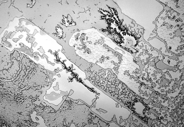
First I thought about an illustration of a broken shield. Then I remembered an article showing things on a microscope, like metallic edges, so I looked for images like this.
First I thought about the feeling someone has of nothing to live for, a meaningless life. Something that was relied on failed (trust, love). The defenses of a person are down, as they have been outwit. The shield is broken.
First I thought about an illustration of a broken shield. Then I remembered an article showing things on a microscope, like metallic edges, so I looked for images like this.

Going back to first thoughts, instead of over complicating too much the message, I decided to use the tears. Doing a bit of research, I found out that there is a study that proved that tears caused by different reasons have different molecular structure, and they look completely different under a microscope. I decided to use a tear caused by pain, which has very interesting shapes.
After doing some tests, and not having too much time after coming up with this idea, I decided to apply this texture to a tear drop shape. In the crits someone suggested to use a flower shape instead, which I found very interesting, since it's a way of taking back the obviousness that was missing but with a more complicated message. Other ideas were given, like applying deboss or use the shape of a petal.


After doing some tests, and not having too much time after coming up with this idea, I decided to apply this texture to a tear drop shape. In the crits someone suggested to use a flower shape instead, which I found very interesting, since it's a way of taking back the obviousness that was missing but with a more complicated message. Other ideas were given, like applying deboss or use the shape of a petal.


No comments:
Post a Comment