Ideas Generation
After having considered different possible contents for the book I decided to make a book about a musician I admire, Carlos Nuñez.
What I really want to convey with it is how he made celtic music break limits and know new horizons, commenting the purposes of the albums, speak about the story behind some tunes, etc. A rough table of contents would be the next:
1.- Introduction
2.- Biography
3.- His Luthiers
4.- Albums
5.- Films
Afer explaining what I wanted to do in the crit session with second years, they suggested I could control the mood throughout the albums and book modifying the colour correction. Another interesting suggestion was to represent his diversity in musics with diversity in designs, typeface, etc. Showing my diversity as designer.
Research
Since I was aiming to have a similar style the artist have on his photographs and illustration, something atlantic and related to the nature of it, I looked through websites focused on landscaping from a designer point of view. I have to highlight Ernest Journal because of their use of the typeface, as well as Another Escape, using big images (I thought of using these big images covering one whole page), the colour correction of photos and how they control the mood of a place with it as well as the use of spaces. 1924 is another interesting website and what I found really interesting is the use of text integrating with components in photography.
I checked several books about book design in order to help me to identify the different elements I had to keep in mind and also to get some inspiration. All of them were useful, but Graphic Design Cookbook was full of ideas. It costs 1p on Amazon, so I bought it for future projects and because of its simplicity showing ideas. Book design and The designer and the grid helped me identifying the grid I needed and the other 3 books helped me with ideas for text layout and possibilities.

In 'style over content' crit, I had a few questions about the publication. Layout was one of my concerns as it is the first time I use a multiple grid, but the changes weren't found annoying, but refreshing. Same happened with the typefaces. It seems that they work together, and Garamond italic was mentioned as very musical, creating a pleasant contrast. The size of the book and the perfect binding both seem appropriate and possible to do in college. When asked about stock, I was suggested to use coated but not too bright to avoid a cheap-magazine look, something satin. Checking GF Smith book afterwards, I found that white-Plike stock (140 gsm) could be very appropriate to enhance the clean appearance of the publication.

Something to improve was the inconsistency along the used images. When I said my ideas about the cover, a hard one with an emboss, it was an idea that they agree can please the audience, using stonish soft colours such as greys, beage, etc.
One of the things I wanted to include in the book was big colourful images that could somehow convey the sensations and feeling Carlos Núñez conveys with his music. This artist keeps a respectful position towards the classics, but what has made him who he is nowadays is the search of new styles and mixtures. In order to avoid being too classic, I aimed to design something clean, varied, and modern.
The chosen typeface for the body text, to go along with the Garamond, is Brandon Text, a sans serif as well, with very smooth shapes that convey the simplicity and modernity previously mentioned. All the typefaces are not presented in their full opacity, but at a 50% of it, to bring more softness and cleanness to the design.
The typeface for headings and titles is Aspira, a choice I made basing this little guide I'm showing below, which has been more useful than I expected. Basically, the key is looking for a contrast within typefaces of the same period of creation, or at least the same or similar tendency. Another document I used that helped me choosing the typeface, apart from the books previously mentioned, was this video from Monotype: http://go.monotype.com/Post-Webinar_Font-Discovery-Sept15.html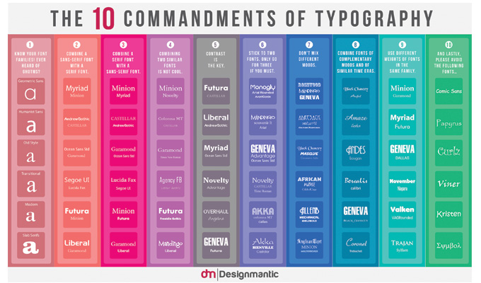
The way I have integrated the text in the images is not something I just copied from Another Escape, but it's something Carlos Núñez has used in his last album, which is a compilation of his best works and it's not on the book since there is not much information in the oficial website I can use.
The big image at the beginning of the book is a way to welcome the reader to a musical and exciting experience, as it shows Carlos playing in it's usual mood, very vividly and carried away by the music. It is in black and white to bring some dramatism to it, as colours are going to be used in other sections to change moods.
The table of contents is very minimalistic and placed between two lines, lines that are going to be key in the rest of the book. These thin lines, after much experimentation, are the cleanest solution I've been able to find to bring some structural components into the design. On the other hand, in the next page, the preface, there are no other components in the text. This is because in this section of the book, I wanted to keep a more literal feeling in opposition of what's to come
The image in the Biography, which is also in black and white as I wanted to keep the mood still at this point, and shows Carlos not playing, but holding the pipes and posing with his arms crossing in front of him, a photograph that makes the viewer feel almost that he stopped to play to tell him a very personal story.
The thick lines are only used for the quotes. It was my intention to make them thick and the text of the quotes aligned to the side of this thick lines, to make it look like the text came out of it. It brings motion and dynamism. The following two pages of the biography are designed like if there was a mirror in the middle, reflecting the page. The purpose behind this was to make it look an easy text to read without much complication.
In the instruments section I start to make use of colours with a mystic picture, that shows him again holding his flute without playing in a beach. This colours are matched in the first and last picture of this section. The rest of the small pictures, showing the different instruments, are in black and white as the ones I was able to find had varied colours and qualities, which difficulted the labour. The multiple grid starts to show its flexibility in this first page by showing three different columns at three different levels. They are not even, but the priority was to place them into the grid rather than looking for a perfect harmony. The next page is very different as there are only two instruments left, giving me an opportunity to keep exploring different layouts. The last picture, taken in the same beach, occupies the whole page to finish the section. In this one, he is playing the pipes and his look suggests intrigue of what's to come.
The mood in the next section title changes completely. Albums, shows him playing again next to the sea, but with a much more serious countenance, looking to the left with the word albums on his back, as something he has already done. But having him looking towards the left, is like looking to the past (we read from left to right, so we take as granted right is future, left is past). The layout for the text again, very minimalistic, showing 4 short phrases that are a presentation to this big section.
From here, every single section maintains the layout of the album the same to establish a structure and a common way to set a beginning of each small section (album). The other pages were designed prioritising different considerations: amount of text that needs to be fit in and variation in every single page. To keep consistence and to make the mood change throughout the albums, I have used images to support it, trying to maintain the same mood in the images of each album with what is in the image and the colour palette used in it. Some of them have been modified to fit these purposes, creating my own visual literacy that can be easily identified as the book is being read. I placed the text in the most varied way I was able to find, taking the chance this brief gives to experiment with layout.
The stock that was going to be used was GF Smith's named Plike, but they don't do A3 so I had to use regular coated paper.
The cover of the book is mocked up, as I haven't had the chance to learn yet how to make an emboss on fabric and how to make a book cover with it. Once it was printed (which had to be printed a 2 or 3% less than its original size, on an A3 spread (115 gsm coated for the pages and 130 gsm uncoated for the cover) or the printing costs were going to be very high) I used the bending machine with the spreads without cutting to, 1 by 1, make the mark in the middle of it. Then using the staple with its adapter for books I stapled it 3 times to make sure everything seated in its place. After that, I used the guillotine and cut where the sign of the bleed was.
I checked several books about book design in order to help me to identify the different elements I had to keep in mind and also to get some inspiration. All of them were useful, but Graphic Design Cookbook was full of ideas. It costs 1p on Amazon, so I bought it for future projects and because of its simplicity showing ideas. Book design and The designer and the grid helped me identifying the grid I needed and the other 3 books helped me with ideas for text layout and possibilities.

Feedback
In 'style over content' crit, I had a few questions about the publication. Layout was one of my concerns as it is the first time I use a multiple grid, but the changes weren't found annoying, but refreshing. Same happened with the typefaces. It seems that they work together, and Garamond italic was mentioned as very musical, creating a pleasant contrast. The size of the book and the perfect binding both seem appropriate and possible to do in college. When asked about stock, I was suggested to use coated but not too bright to avoid a cheap-magazine look, something satin. Checking GF Smith book afterwards, I found that white-Plike stock (140 gsm) could be very appropriate to enhance the clean appearance of the publication.

Something to improve was the inconsistency along the used images. When I said my ideas about the cover, a hard one with an emboss, it was an idea that they agree can please the audience, using stonish soft colours such as greys, beage, etc.
Production
One of the things I wanted to include in the book was big colourful images that could somehow convey the sensations and feeling Carlos Núñez conveys with his music. This artist keeps a respectful position towards the classics, but what has made him who he is nowadays is the search of new styles and mixtures. In order to avoid being too classic, I aimed to design something clean, varied, and modern.
The chosen typeface for the body text, to go along with the Garamond, is Brandon Text, a sans serif as well, with very smooth shapes that convey the simplicity and modernity previously mentioned. All the typefaces are not presented in their full opacity, but at a 50% of it, to bring more softness and cleanness to the design.
The typeface for headings and titles is Aspira, a choice I made basing this little guide I'm showing below, which has been more useful than I expected. Basically, the key is looking for a contrast within typefaces of the same period of creation, or at least the same or similar tendency. Another document I used that helped me choosing the typeface, apart from the books previously mentioned, was this video from Monotype: http://go.monotype.com/Post-Webinar_Font-Discovery-Sept15.html
The way I have integrated the text in the images is not something I just copied from Another Escape, but it's something Carlos Núñez has used in his last album, which is a compilation of his best works and it's not on the book since there is not much information in the oficial website I can use.
The big image at the beginning of the book is a way to welcome the reader to a musical and exciting experience, as it shows Carlos playing in it's usual mood, very vividly and carried away by the music. It is in black and white to bring some dramatism to it, as colours are going to be used in other sections to change moods.
The table of contents is very minimalistic and placed between two lines, lines that are going to be key in the rest of the book. These thin lines, after much experimentation, are the cleanest solution I've been able to find to bring some structural components into the design. On the other hand, in the next page, the preface, there are no other components in the text. This is because in this section of the book, I wanted to keep a more literal feeling in opposition of what's to come
The image in the Biography, which is also in black and white as I wanted to keep the mood still at this point, and shows Carlos not playing, but holding the pipes and posing with his arms crossing in front of him, a photograph that makes the viewer feel almost that he stopped to play to tell him a very personal story.
The thick lines are only used for the quotes. It was my intention to make them thick and the text of the quotes aligned to the side of this thick lines, to make it look like the text came out of it. It brings motion and dynamism. The following two pages of the biography are designed like if there was a mirror in the middle, reflecting the page. The purpose behind this was to make it look an easy text to read without much complication.
In the instruments section I start to make use of colours with a mystic picture, that shows him again holding his flute without playing in a beach. This colours are matched in the first and last picture of this section. The rest of the small pictures, showing the different instruments, are in black and white as the ones I was able to find had varied colours and qualities, which difficulted the labour. The multiple grid starts to show its flexibility in this first page by showing three different columns at three different levels. They are not even, but the priority was to place them into the grid rather than looking for a perfect harmony. The next page is very different as there are only two instruments left, giving me an opportunity to keep exploring different layouts. The last picture, taken in the same beach, occupies the whole page to finish the section. In this one, he is playing the pipes and his look suggests intrigue of what's to come.
The mood in the next section title changes completely. Albums, shows him playing again next to the sea, but with a much more serious countenance, looking to the left with the word albums on his back, as something he has already done. But having him looking towards the left, is like looking to the past (we read from left to right, so we take as granted right is future, left is past). The layout for the text again, very minimalistic, showing 4 short phrases that are a presentation to this big section.
From here, every single section maintains the layout of the album the same to establish a structure and a common way to set a beginning of each small section (album). The other pages were designed prioritising different considerations: amount of text that needs to be fit in and variation in every single page. To keep consistence and to make the mood change throughout the albums, I have used images to support it, trying to maintain the same mood in the images of each album with what is in the image and the colour palette used in it. Some of them have been modified to fit these purposes, creating my own visual literacy that can be easily identified as the book is being read. I placed the text in the most varied way I was able to find, taking the chance this brief gives to experiment with layout.
The stock that was going to be used was GF Smith's named Plike, but they don't do A3 so I had to use regular coated paper.
The cover of the book is mocked up, as I haven't had the chance to learn yet how to make an emboss on fabric and how to make a book cover with it. Once it was printed (which had to be printed a 2 or 3% less than its original size, on an A3 spread (115 gsm coated for the pages and 130 gsm uncoated for the cover) or the printing costs were going to be very high) I used the bending machine with the spreads without cutting to, 1 by 1, make the mark in the middle of it. Then using the staple with its adapter for books I stapled it 3 times to make sure everything seated in its place. After that, I used the guillotine and cut where the sign of the bleed was.
No comments:
Post a Comment