We got in touch with Street Feast to get a series of pictures in high resolution. First, Hannah worked on the illustrations and animations. While she was working on them I did some research in order to find out what layouts, typographies and colours could work best with our idea.
It's important to notice that the Street Feast logo is centred. To live in the same space as justified text it needs distance or otherwise, the inconsistency becomes too obvious and awkward.
Then it was time to try out different layouts that could give space to the illustrations and deliver a clear message at the same time. The message needed to be detailed, as it's about giving information of the different places Street Feast has. Also, titles should be long enough to cover the phrases that were thought in the idea generation phase. This experimentation with layouts was also a good opportunity to keep experimenting with typefaces.
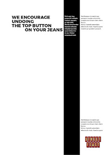
Note: The 3 vertical lines are just something to substitute the illustrations that weren't made at this point in time.
Note: The 3 vertical lines are just something to substitute the illustrations that weren't made at this point in time.
All these layouts that were inspired by Swiss design, specifically by the work of Josef-Müller Brockman, were shortlisted to the ones that had more potential to synthesise and clearly convey the right message.
At this point in time Hannah had finished her illustrations, so it was due to experiment with colours and see how everything worked together.
The colours used were the colours of the logo and a peacock blue to create that contrast. Some posters are without any photography and they rely on typography and the message. We thought the combination of these two types of posters would make them seem more rich and varied. These were the results.
The feedback the design got is that if the food is floating, it seems too generic and random, like McDonald's. To avoid this we decided to leave the background and made some modifications to it, like make it more blurry, darker, etc so the food would still have the prominence. Also, the text should be smaller to give more importance to the food. It was also suggested that the illustrations should have a different colour from the background to stand out more.
The problem with showing the whole picture is that small text isn't as readable, so the text and the picture needed to be separated into sections.
Also tried out the picture in one single colour and covering the whole poster searching for other types of contrast with the floating text. It is a more "food in your face" approach, the colour vibe is more obvious and would help to make the posters more recognisible. The picture in the background determines how readable the text is and there are limitations of contrast, as images in the background might be too dark or light or the colour needs to be changed.
Before going to get more feedback, I thought it'd be a good idea to strip down the design starting from the colour palette and using only 1 colour with black and/or white. Used the app Coolors to find a warm colour that made the contrast with the logo.
This new colour was more inviting, warm, made the contrast with the logo and didn't take the attention away from the food as well as letting the illustration to stand out.
In the feedback session, I briefly explained to the other peers our strategy. We wanted to advertise this festival as warm and alive, leaving the customers with a feeling of "that was a lovely evening". There are two types of posters: image-based and text-based.
I explained that Hannah and I had different points of view. My perspective is that the conversation should be about the experience that is going to the festival instead of the food. There are other thousands of delicious places to eat at in London, and they probably are advertising themselves with better photography. If people decide to go there might be because of the food, but the experience needs to be out of the ordinary. That's why in the strategy we identified the personality, tone of voice, etc of the festival and that's why we decided to make the illustrations, to give the food an extra dimension of fun, playfulness and creativity.
Hannah thinks it's best to put the food first, as it is their product, but when we were discussing what should stand out in the posters she said both. In design, there needs to be a hierarchy for a message to be understood. If all the details of the food come first, illustration is going to be mostly unnoticed. They can complement each other and have the same degree of prominence, but the design will lack of focus and the message will be diffuse. She then explained that she drew certain elements of the illustration to draw the eye to certain parts of the food.
Alec agreed with Hannah's points of view and said that it's all about the food and the experience will be part of the people getting the food there, that it's taken for granted. I disagree on this point. Big brands like Apple or Nike don't sell the features of their product. They don't try to convince their audiences their products are better than the rest of the others in the market. What they do offer is an experience, a lifestyle, a philosophical statement. The elements drawn in the strategy were drawn in order to serve this interpretation we had of what the Street Feast is, not about how tasty or good the food can be. The purpose is to drag people in with the promise of a great evening, a wonderful time with their friends in a lovely place instead of the taste of the food. The food can be the best, and it won't be as good if it's not shared with their beloved ones.
I explained that we should put both views on a scale and keep the one with more advantages. That it's very different to say "we make computers because we want to make the best computers" than "we are changing the world, and for that, we make these computers".
Nonetheless, the design should explore that area. Hannah and I discussed how we could work this out and she had some examples in mind.

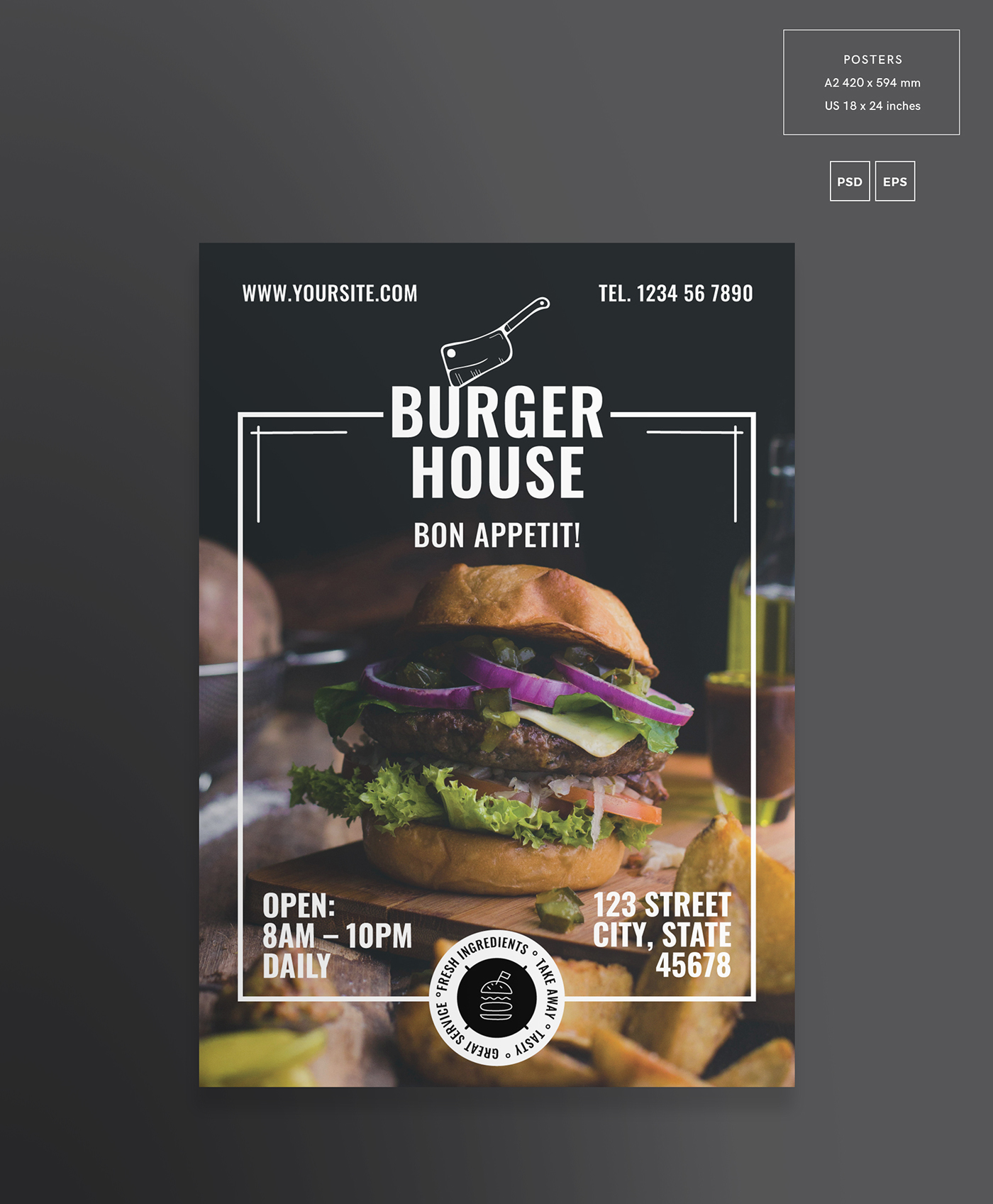
Placing white shapes on top of the images was going to be a troubling task, especially with small text. In order to use the layouts that were already designed, the pictures had to be adjusted. White colours needed to be darker for the text and illustrations to stand out and be readable.
After trying the new designs, they seemed to work all right. The locations of the different places of Street Feast were added as well as the website in a corner. More modifications:
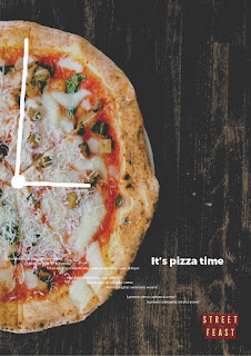
Since we are going to make the theme about the food and the design is not using any specific colour palette, for the text-based posters, the idea is to keep showing off the food and even use its textures and colours to fill the text shapes. Small text remains in black to be completely readable. The pictures used for this purpose are darker and more saturated than the usual in order to be perceived on a white background. Also, the pictures used for these posters are different from the others.
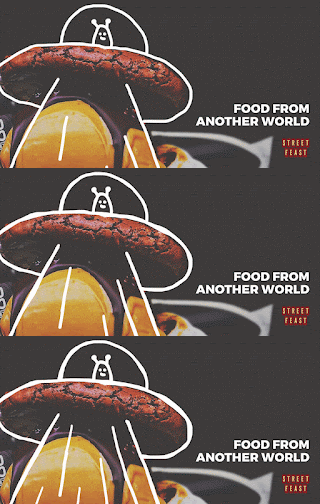
For the social media animations, the size used was 1200x621, which is the optimum size for Facebook, their most active profile. These are some of the drafts:
The first version shows the whole dish floating with the whole pictured darkened on the background.
The first version shows the whole dish floating with the whole pictured darkened on the background.
Second version is more focused on the food and the animation without having it floating. This resulted in the picture being cutout, but in a more impactful outcome.
Hannah and I both decided to go for this type of design and all that had to be done was to import the animations into this layouts. This is the final result:
We both were very happy with the result. As it is shown on screen, the tagline is all that the design needs. With one click, the user can go straight to the website and learn more about Street Feast. The animation is only there to catch the attention of the person that is scrolling on Facebook.
Both of us revised everything several times before submission. I submitted all the work, as I had all the final designs but Hannah was virtually present.











No comments:
Post a Comment