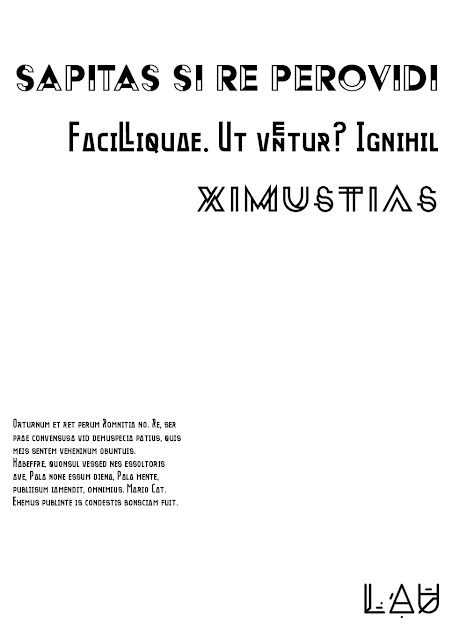
This could be applied to typographic treatment as well. Using bent paper typeface, typographic parts to complete a message of recycling, minimum and smart use of elements. Also, the use of simple shapes can reflect the idea of how meaningful things can be created with very little.


This exploration was taken to the computer to see how it would work on digital.


The creation of these elements led to an extra typographic research. Now, with the visual ideas clearer in mind, maybe new ideas would come up when looking into typographies. It was then when the typography Oko was found. This is a typography that reflected many of the things that were explored on the sketches. It is also a reduction and clarification of those concepts. This is a typeface that fit into the millenial mindset of caring about environment, using recycled products and hand-made stuff. It also resembles some futurism, as the type looks like a futuristic city with flying cars. It is a positive way to look at what's to come.

The exploration with typefaces and colours was done through designing the design of posters. At first, it was about trying out typefaces to shortlist a few, start designing the posters.


No comments:
Post a Comment