A - A pharmacy has kept the façade for a long time. The A, with the rest of the typography, is quite tall and with the thick strokes and the serif style it really portrays the essence from old times.

B - The Bank of Spain in the center of Salamanca has a very classical kind of architecture, and same applies to the typography, which fits in the general choices in the city.

C - I think this is an example of wrong design. Cafeteria is bigger and more visible than the actual name of the cafeteria, which is Anubis. They both are in the same typeface, so there is no contrast. But one thing that deserves to be rescued is that 80's-90's feeling the typeface has and how well it fits in the context, and the C is a good example of that symmetrical, strong and round shape.

D -Montaditos is a chain of bars who serve tapas. The design reminds me of an andalusian patio, something very Spanish. I focused on the D because it has some ornament, but not too much, like the A might have or the T, which doesn't really fit with the rest. This is also an example of how the Art Nouveau is ingrained in the Spanish culture.

E - A mechanic's shop with a typeface that reminded me of the 50's or 60's. It has a familiar business feeling.

F - I focused on the typeface on top, where it says 'Droguería, perfumería'. This typography reminded me of the videogame Bioshock or the film Metropolis, who are known for using the Art Deco aesthetic.

G - La Galería seems that it was either a shop or a bar. It's quite interesting how they have a newer sign but they also keep the old one, which can be seen in other parts of the city and even in villages, where the old letters have been conserved sometimes for more than a century.

H - A restaurant with a medieval typeface, as Salamanca is a very old city known for its historical buildings and many businesses want to take advantage of this touristic attraction.

I - A official shop for tourists where they can get information about the city as well as souvenirs. It has a childish handwritten typeface, I suppose to convey friendliness.

J -The J in this sign looks very old fashioned, and even more when it is alongside the other word in a handwritten typeface. A good combination of shapes that brings the essence from more sober succint times.

K - This letter is not common in the Spanish language, so I had to get one from a graffiti. It's the face of the former president of Spain, J. L. Zapatero, with the word kill next to it. A strong statement as a protest that has a solid typeface to convey it.

L - This typeface stays in line with the rest of the images. The L is specially thin on the leg, which caught my attention.

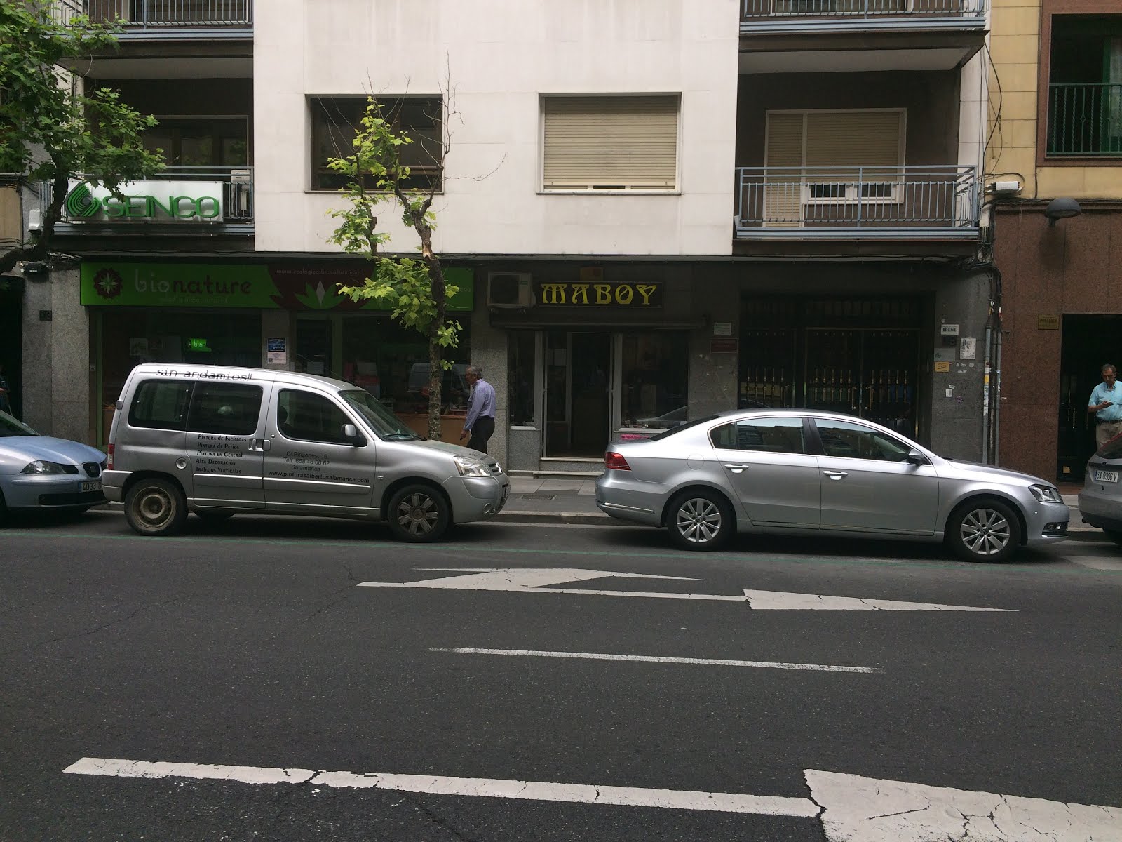
M - Maboy is a haberdashery. I think the typeface and colours are not appropriate for this type of business. The yellow colour over a brown-black background and the Y with the shape of a cocktail glass made me think it was some kind of old fashioned bar founded in the 60's or 70's in a more conservative time, where the Art Nouveau was more popular.
N - Again, the Art Deco style with a very uneven typography, which has both wide and thin characters used for a confectionery shop, which doesn't really convey what it should.

O - This kind of typography can be found in buildings for education run by the catholic church. It's very thick and rounded. The connection made is almost illogical.

P - A classic combination between gold and wood, which has a navy feeling. I noticed the bowl of the P was quite high in comparison to the rest of the letters.

Q - Quinta Cumbre is an ice-cream shop. The combination of colours and typography (Times) doesn't seem to fit the purpose, and it looks more like a spa or a beauty center.

R - This type of typeface is another example of how the Art Deco was once a preferred choice in the central areas of Spain used for a pharmacy.

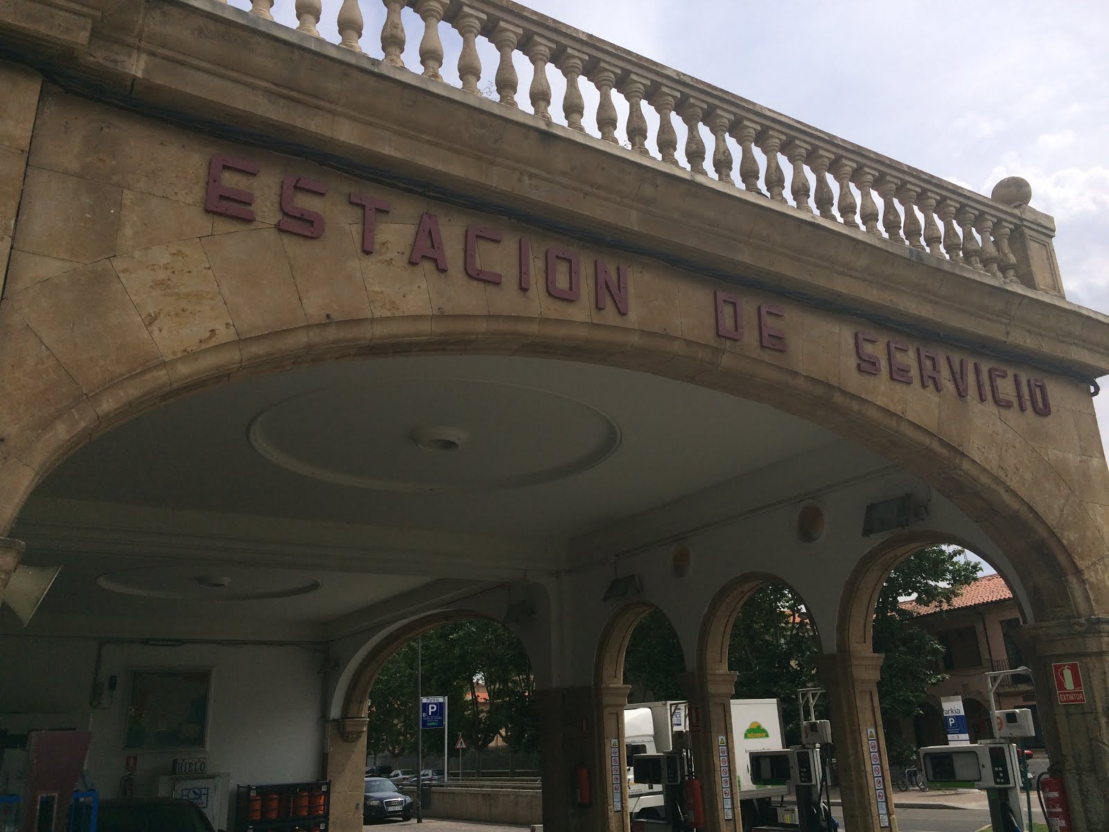
S - The Salamanca Motor Museum had an old firefighter vehicle and the "supply station" sign on top in two different typefaces. Both looked old and really had the feeling of the 50's Spain.

T - A restaurant that uses a calligraphic typeface which conveys tradition and high-standards, as well as familiarity.

U - This typeface can be found everywhere in Salamanca, and the locals know it well as the Typeface of Salamanca, as it is quite unique. It can be easily found on the University buildings as well as government's.

V - Novelty is a bar/cafeteria. The used typeface has an art deco feeling with some sophistication in it, since it is a cafeteria with history, and it's quite popular for holding meetings of famous Spanish masons.

W - The "W" is another very uncommon letter in Spanish, so I wasn't able to find a spanish word containing it. This bold typeface goes with the name of the store as well as the type of clothes they sell. It's a boutique, not a regular store, so it's drawing the attention of those who want to wear differently.

X - The X is also a very uncommon letter in Spanish, so I took the chance when I could and I got this picture which uses the same or a very similar typeface from the "U". The medieval appearance of the typeface makes the U look like a V, and sometimes some contractions can be seen. For instance, the word "de", which is the preposition "of" can be found as one single symbol.

Y - In the city, there's even a museum of Art Noveau and Art Deco. The typeface in this instance has some details that can be associated with Art Noveau, and the Y is one of those letters, that has a detail at the base as if the letter is being handrawn.

Z - Very similar to the T and the U, this kind of typeface is extensively used in Salamanca as it is a historic old city, so they want to use it as a tourist attraction, make the visitor feel they are in another time. This, of course, implies some high standards that might not be in the service but only in the price. Medieval typefaces are a common resource and the shape of this Z can be confusing for a tourist if it wasn't because "Plaza" is a wide known word.

Another examples that can support these typefaces:


No comments:
Post a Comment