Just to clarify, being republican in Spain is like all the opposite of being republican in USA. Normally, people who support the republic are left-winged.
In Spain has only been republican twice: In 1873 to 1874, and the second, from 1931 to 1939. Franco was the one finishing it and his dictatorship lasted for 40 years. The current Spanish government and high social classes are all families and relatives of the tiranny Franco established and left behind.
The design aims to represent how a 3rd republic note would be nowadays with the original Spanish currency before the Euro took over, the Peseta. For that, I've been researching about different personalities that could represent the values of the republic. The ones I would highlight are La Pasionaria, Manuel Azaña, Dalí, Lorca and some others.
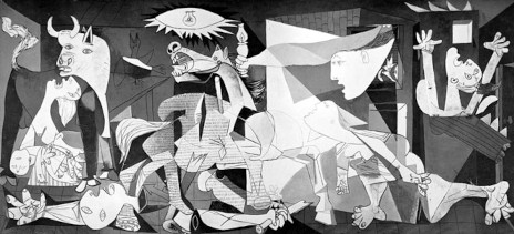
I finally decided to use Pablo Picasso, as I really wanted to make the note have something to do with arts. Besides, he is the one that really represents the spirit of the republic, as his work, The Guernica, is the representation of a massacre that took place in a small village during the civil war. The intention of this piece of work was to make the Spanish people not to forget who did that.
But there is other features to consider if I want to make the bank note richer and with deeper meanings.
Despite old republican notes are quite ornamented, probably the most important fact, a country without a king and royal family, should be represented with simplicity and lack of ornamentation.

If a building is needed, the Picasso museum in Malaga has a symmetry that can fit both in the design and in the concept.

Also, the recent Spanish political party Podemos has republican ideologies and they have gone for a very modernist design approach. Might be a good idea to keep them in mind.
The Allegory of Hispania is one of the most important symbols of the Spanish republic that can be found in many different formats. It's definetely something to include.

About production methods, when the Euro came up, people missed the roughness and personality of the peseta. The size has to be bigger than the Euro in order to bring back that feeling of reliability the Euro has taken away. Since the peseta has less value than before now, the 1000 pesetas note (equivalent to 5 pounds) will have the same size as the old one, so it would look stronger than it should.
I wouldn't use the colours of the Republican flag for a bank note, but since it's an exhibition it will call the attention of those aware of the Spanish history, so it might be a good idea to use them. Also, purple is the colour that makes the difference between the kingdom and the republic, something to definetely to keep in mind.
I think making a design like this could be both controversial and welcome in Spain, and also be quite shared on social networks, which could be very beneficial.
Another thing I realised checking other bank notes is that the people represented on them aren't usually looking at the audience, but somewhere else. My interpretation is that they might have been illustrated like that to represent them as visionaries, with their ambitions and their vision of the future.
No comments:
Post a Comment