Tuesday, 10 April 2018

Peter & Paul: Poster Design - Research

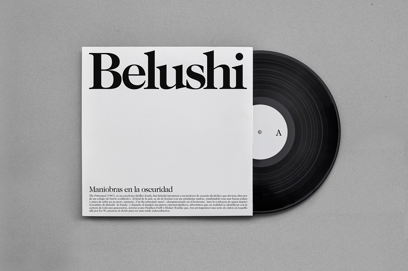
The research focused on posters and other forms of editorial design that were related to the use of photography, ink or printing for it to be related to the quote.

These images are from the Internet or books like Josef - Müller Brockmann Pioneer of Swiss Graphic Design, Typografische Monatsblätter, Helvetica Forever and 100 years of Swiss graphic design.

The focus was especially on works that had long quotes or at least some text that could be re-shaped.


This type of layout allows a long text to be read from a certain distance.


The use of smaller text on a bigger size could also be an option, like this example of Portsaid desing.


Splitting the quote into letters or smaller parts could also be a possibility like this design of Metamorphosis.


The opposite approach of a design purely based on text and covering almost the entire poster with text in different sizes.


This is an interesting approach from the designer Mane Tatoulian where she used the texture of mixed paint as a background. This particular combination of white text and colours is not very legible, but different combinations could give a more readable outcome.


This is an interesting example of a typographic work that is not very readable unless it recurs to repetition.


Chromatic aberration and other effects may suggest the manipulation of lights that could be appropriate for the approach related to photography.


The use of spot lights also lead to the idea of simply using circles for the design:


Following this logic, dots could also be applied to halftone designs, which can include photography.


Other different typographic approaches that show long quotes in a very visible way and layouts that allow the inclusion of :


Sunday, 8 April 2018

Peter & Paul: Poster Design - Brief Interpretation

Initially, I was going to design something for the Secret 7 competition, but Peter and Paul got in touch with me to invite me to be part of the commissioned work they are doing for LAU. This brief was more or less of the same dimensions (in terms of work that needed to be produced and time to do it) as the on that was going to be produced for Secret 7, so the times weren't going to vary that much.

This brief was a fantastic opportunity to work with another studio in creating something for Leeds Arts University. It's exciting to be given the opportunity to leave such a mark after 3 years of hard work. Something to look at and be proud of in the future.

I and other 47 students are making designs of quotes alumni have said about their experiences at Leeds Arts University. There is absolute freedom in what needs to be designed, besides of including the quote and making sure it's readable. The poster needs to be size A1 and it needs to include the following quote, name and date:

"I loved the smell of the photography rooms and the print rooms. 18 years later, the smell of the stop bath or ink on paper still instantly takes me back".

Leanne Taylor
2001

They also added a few points to consider. The most important were:

— You’ve been selected because of your portfolio suits this project, but it’s a great
opportunity to really let yourself go.
— Your poster MUST include the quote as text.
— Don't design anything too small. It should be readable from a distance.

We were also given a very limited colour palette (Yellow, white and black) which we could choose the colours from.

Wednesday, 4 April 2018

Time organisation throughout the year

At the beginning of the year, I outlined how the time was going to be distributed. I was aware that briefs could be changed or swapped, so it was important that if this happened it had to be with briefs that required a similar amount of work or time.


As it can be seen from the information of the picture on Google Photos, it was taken the 9th of October.


That's something that has been essential when moving on with briefs. This is the look of the sheet with the time calculations for each brief, and it hasn't changed that much (except when it comes to switching briefs). This shows that the dates established have been met with little delay or not delay at all.


Establishing this terms at the beginning of the course has been super helpful in order to avoid briefs going out of hands.