A quick mock up to show how everything could work for the feedback session could help to identify what needs more work.


During the Feedback session with the creatives from Only Studio the mock up needed to be judged to move on. After sharing the thoughts and ideas for the design, recommendations were not to limit the target audience too much. It's good to design for a specific audience, but it is also good to stay open to other possible ones.
The website gog.com was also mentioned during this session as a possible source of inspiration.
The colours are indeed retro in this mock up but they need to be more vibrant and less flat if that feeling of toy and youngfullness wants to be praised.
The interaction between users to introduce new content was also something mentioned as a key to make this platform work.
Someone also suggested to make possible to play on 2 player mode for videogames like Super Mario. The problem is that these games were written in such way that multiplayer might not be a possibility, but that option will be added in the design.
One of the doubts was where the design should start if it's going to be for different platforms. The professional from Only said that it needs to be designed for the platform that is going to be used on the most. In this case, a PC or a laptop seems to be the type of platform this type of user would use to play this games according to the suggestions of the peers and my own perspective. Although, the design has been made so the navigation from consoles (which would be an obvious platform for users to play with) would be easily adaptable for using it with a controller. A version for the phone would require more changes.
The mock up seemed to streched. 1280x800 is a better resolution for this kind of design.
The most important thing was to specify a user journey, which is making the user able to find games through different but simple ways.
After some drafts the shapes with rounded borders and with a chubby appearance seem to do the work. This with the simplicity intended for the menus should feel old but in a good way, reminding times where everything was simpler.
Japanese styles, like the golden boxes, can be seen in many games from the 90's, giving a fresh look to the designs of games related to things like water sports or similar illustrations.


After trying these combinations the design seem to look simpler and light without that depth. Although, a similar effect was used for the play button in the pre-game screen to make them stand out, but the arrows for the top of the page were left flat.
The menus are inspired in old japanese video games, as that was the golden age for this nation in video games design.


After researching different typefaces, the design uses just three: Basica v.2012, Atari Font Full Version and Press Start 2P. This last one is very similar to the second one, but more pixelated, so it's used just for quotes or big titles and typographic elements like the arrows. This limited use of typefaces is to keep the retro look. The hierarchies are determined by the size of the font or the colour it is represented in, being the red the primary colour, the blue the secondary and the Yellow as third choice. Other colours like grays and dark purple are to serve as a background or contrast to the others. These colours have been chosen using some of the examples in the research section where designs can praise retro gaming and used the app Coolors to find colours that worked well together.
The website layout is a screen of 1280x800 (as the designer from Only suggested) divided in 6 columns based on 12 column grids websites which are effective and allow to sort information in many different ways.

These are some of mock-ups that illustrate the process of designing the UI. The aspect of the boxes for the games had to change, as most of the videogames cover art are designed vertically
 .
.

After some drafts of what the app/site map is going to be and after designing it, this is how everything is going to be interconnected

The app/website (which is, in short, like a Netflix or Spotify for videogames) will start by showing the logotype of the platform and the press start button, something that was common to see in almost every videogame until not long ago. Of course, there is no start button if it is a website or an app, or at least it won't be configured as such if using a controller, that's why the user can click anywhere to go to the next step, which is the usual signing in screen. This suggestion also sets the mood of the platform, which uses humor in subtle ways. Also, different information that can be useful for non-members is displayed at the bottom of the page. An exciting retro animation for the background with music could make the main page more exciting and welcoming.


After loading (with another humorous and nostalgia-triggering message) it takes the user to the section "featured". This section and the other main ones have more vibrant colours in opposition to the previous screens and should encourage the audience to register, since nowadays people can see how it is on YouTube or through images without the need of paying it. The mock ups are shots of what the website would be like and the content might seem tightened up, but it's important to keep in mind that users will be able to scroll up and down and the content should have more room to be shown during the real experience.

The website is divided in three main categories. The three of them has big arrows pointing to left and right on the top of the website/app allows the user to switch or rotate between modes which is also represented by the colour of the background, which is a pixelated gradient in most of the cases and not a flat colour as it gives a sense of differentiation of the head of the website (which is going to be static above the name of the section or subsections, these included) and the body.
The other sections that can be accessible from the top are by order shelves, contacts, hall of fame, milestones, settings, control settings, important info, notifications and search further explained later on. These buttons are organised in such way that imitates the positioning of other popular platforms. For instance, the notifications button is on the right like it is on Facebook, settings buttons are grouped in the middle, etc.
Featured: the home page, which shows straight away a big box with the last addition, game of the week, a space for news and lastly (which intends to make users to go through the other three) a curiosity about old videogames. Thus it promotes new content or provides a space for advertisement that want to pay for their games to be promoted. This section will only show the most popular, last added content and the games of the month (based on the games of the week, which will show what games has been played the most or which ones have received the best votes).


Browse: a section that provides the user the facility to navigate through all the content in different ways defined by the subsections Genre, Year (of release), Console and Country (of development). Another subsection named "game finder" is a different kind of browsing method that works with filters, allowing the user to browse content with limitations to ease the process of finding a new game if necessary. This limitations will only involve genre and console as the user can sort the content by year if necessary. Note: the game finder only has one arrow to sort, as the content is not displayed in rows, but as a page of results.


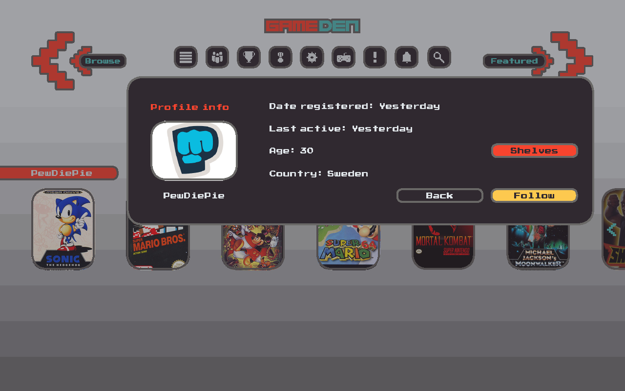
Follow: section that allows the users to explore content through other users experience. This section also gives the opportunity to explore other profiles that might share similar interests. Rows that are based on other users Top 10 or shelves can be clicked for more information about their profiles and there the user can follow others. This window showing the profile will be facilitated in other contexts, such as streams. In the "following" subsection the user can find the rows with the Top 10 of the users he or she is following. In the follow section, the user can also see the lists made by popular people in the sector (game designers, youtubers, etc) in a subsection called "Gurus". Suggestions will offer the user people with similar taste in games based on what he or she has liked in the past using an algorythm similar to Netflix or the radio in Spotify. In the stream subsection the user can both stream and watch streams.This would be run by platforms such as Twitch or Youtube but providing the user the possibility to do it directly from GameDen. This has been already done by other platforms such as PS4, where a user can both stream and watch through external services without leaving the PS4 environment. GameDen will provide in the miniature the thumbnail the user sets from the external services as well as their names, viewers and language. This is the only subsection organised by games and the rows will display users, not games, so the stroke around these windows has a different colour to indicate the user that he or she is going to be taken to another site.


The pre-game screen is blue with the console on the back, which despite being not very visible with all the information over it, it will be briefly shown before the boxes as a focus on a specific platform. This sets a preparation for what's to come next. In case of doubt, the name of the console and an icon with the controller will be shown for easy recognition. This screen shows the original game cover, the description or overview that it originally had at the back of it, date of release and platform and curiosities about it. In this section there are 8 actions the user can do: play the game, queue for a 2 player game (if possible), add the game to a shelf, rate the game, visit the hall of fame for this game, start the game streaming, modify the controls or go back to the previous screen.
Notice that there is an arrow in the dark purple sections, which takes the user back to the feature-browse-follow section, exactly as it was left.

The other colour is a dark purple for the background of the boxes as well as the background for the extra sections of the site, like shelves, friends, etc as they are sections to organise content and this colour is more appropriate for concentration and a more private administration mood. Users cannot vote their own lists, and some like Top 10 and Finished Ones are automatically generated, and also editable. When floating windows appear, the background will be darkened to make them stand out. The only window that won't make this happen is the notifications, as it has no repercussion on the rest of the page or it simply doesn't need that extra focus as it covers a small section of the screen.
The suggestions subsection is one of the only managed by a algorithm, which recommends the user shelves based on the content in what they have voted, played, followed, etc.

Having the titles of the different rows of content (inspired from Netflix layout) is a good way to keep the text in boxes that also change their size depending on the text, which gives a less repetitive look to the browsing. If all the boxes were of the same size the eye couldn't identify the difference between rows, so with this decision the design should facilitate the user a more natural browsing experience.
To increase this recognition of content pictograms will be displayed where it is necessary to recognise to what console a game belongs to.
Iconic and funny puns and quotes will be used in different screens to remind the users about very special moments of these games that are part of the collective memory as well as encouraging or suggesting users to check out content based on what these quotes are about. They are clickable and take the user straight to the game in question. With this the design should focus more on the user experience, enhancing the personality old games had and its players. This is a list of some of the quotes that might be used for this purpose:
Congratulation! You have completed a great game! (Ghostbusters)
A winner is you. (Pro Wrestling)
Suffer, like G did. (House of the Dead 2)
I will kill your d**ks! (Bulletstorm)
I am the great mighty poo, and I'm going to throw my s**t at you (Conkers Bad Fur Day)
C-c-c-combo breaker! (Killer instinct)
What is a man? A miserable little pile of secrets. (Castlevania: Symphony of the Night)
Boomshakalaka! (NBA Jam)
Finish him!! (Mortal Kombat)
Toasty! (Mortal Kombat)
Get over here! (Mortal Kombat)
Snake? Snake? SNAAAAAAKE!!! (Metal Gear Solid)
You spoony bard! (Final Fantasy II)
Sonic Boom! (Street Fighter II)
Seeegaaaaaaaaaaa. (Every Sega Genesis game)
Hadouken! (Street Fighter)
Shoryouken! (Street Fighter)
The president has been kidnapped by ninjas. Are you a bad enough dude to rescue the president? (Bad Dudes)
Wakka! Wakka! Wakka! (Pac-Man)
You were almost a Jill sandwich! (Resident Evil)
Jill, there's a lockpick. It might come in handy if you, the master of unlocking, take it with you. (Resident Evil)
It's dangerous to go alone! Take this. (The Legend of Zelda)
I am error. (The Legend of Zelda II)
It's super effective! (Pokemon Series)
In the shelves section, which can be accessed at any time from the top of the screen, the user can create something like "playlists" of games. Shelves can be shared and visited by other users or they can be private. The user can also choose a Top 10 games to show to other users, and this data can be used for the featured section to show peoples favourites. Users can vote other users shelves (not their own) and the most voted can appear on the featured section. This should also encourage people to drag friends in the application if their goal is to have good votes on their lists and become someone appreciated in the retro gaming scene. In some sections or subsections the rows can be voted, since what the user is actually voting are not the rows themselves, but shelves disposed in the form of a row, which is the way the content is displayed throughout GameDen. Rows like last additions, most popular games, etc don't have the possibility to be voted as their purpose is to provide something that people might find useful in order to find new games.


Nonetheless, some of the rows in the 'browse' section (like the year of release or console) can be voted for users to know other users opinions and feelings about specific consoles or years.
The rows and the content in them are automatically displayed in alphabetical order. The arrows situated on both of the sides of the section title (which are intended to stay fixed at the top of the page) have the functions to sort both rows and the content (vertical and horizontally) alphabetically, chronologically, by developer or console, by rate or based on when the content was added to the platform. The white arrow on the window is also clickable to choose if the order is in one way or the other way around.

The notifications (accessed from one of the icons at the top) work in a very similar way to Facebook, but they aren't intended to have the same or even similar protagonism. They are there to inform just about a few things to the users: an addition that they might be interesting for them based on what they have played (algorythm), friend requests, game invitations and the modifications of shelves that are being followed.
When users are followed by others this won't count as notifications (it can be seen in their friends section) as the platform's purpose is to use social network features to encourage users to play and explore more games, but not to provide a space where social interaction is the main activity.

The account options can be found in one of the icons at the top of the site. This section is designed for the user to spend the least possible time adjusting meaningless and annoying settings. The information such as the nickname, method of payment or profile picture can be edited by clicking on the pencil icon. The stream service can be linked with a code that can be found in the account of these services. In case of not choosing any profile picture, something like a random colour or shape will be assigned. The rest options are about privacy, disponibility and language. All the privacy options throughout the platform, from shelves to profile settings, would be set as private to protect those users that don't know about this feature.

In some sections (and as a expandable button at the top) there is a search bar that will facilitate the user to find content based on the search of an specific name. It can be the name of a game, developer, year, user, etc.
Other important menus are the ones shown right below:


The Hall of Fame shows which users have achieved the highest points in different games, like in the old arcade machines where a user could register 3 letters at the end of the game. Luckily, we live in a time that more than 3 letters can be used.

Milestones are differen from Hall of fame. They are trophies or titles the user receive for achieving certain things. This and the hall of fame are there to improve the user experience and motivate players to achieve these milestones that can have rewards, such as a month subscription or a subscription for life if it is one really hard to get.

The lobby is just the screen the user will be at when is matched with a second player before a game or when he or she is with a friend ready to play a game. They can use this chat to make preparations before the game.

The game screen can use the black area around it for buttons or functions, as most of the retro games are designed for 4:3 screens and nowadays panoramic screens or 16:9 are the most common. For example, the screen that shows the other player and it can be minimised.

It's necessary to have a GameDen menu in the game to allow certain changes without the need of going out to the main menu.

When streaming, the screen gets resized so the live information can be shown on one side. This can be hidden depending on the user's preferences.

A very primitve mock-up of GameDen can be tried out here: http://bit.ly/2jwmcnA


