Wednesday, 6 April 2016

Currency Design - Development

The following pictures are part of the process that eventually led to the final outcome. There was some experimentation with the V shape, but for some reason it didn't look like a bank note, but like a voucher or something else. The priority is to make the design easily associated with the idea of a bank note.

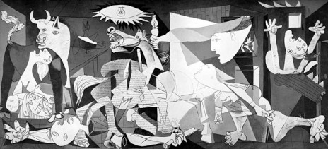
To enhance this feeling, I followed this tutorial, and customised the technique to this piece of work. As background, I first tried with some Picasso's pieces of art, the Picasso's museum in Malaga, but there was too much going on. I wanted to implement cubism somehow, so I used a very simple design I was able to find on internet and modified it in colours, shapes, shades, lights, etc to make it fit as I intended to.

The Allegory remained in the center as I first planned as that is a usual practice of designers to leave an icon in the middle, and it was important to keep that bank note feeling. The colours were intended to stay, as she is carrying the flag of the republic, but as these colours were in the colour swatch, it was a little bit redundant to leave them. The Allegory is the piece of the bank note that would remain in other bank notes of the same kind, and picasso is the protagonist in this particular one, therefore it needs to be portrayed occupying more space than the Allegory.


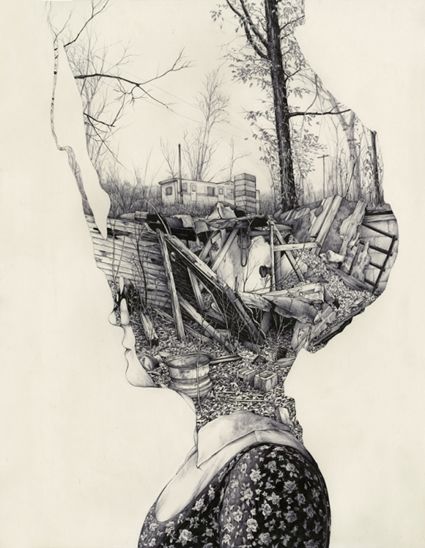
Elements used. It was incredibly hard to find copyright free images in high quality.


Currency Design - Ideas Generation & Feedback


Ideas Generation & Feedback


Since I was going to use Picasso as the main personality for the bank note next to the Allegory of Hispania, a way to put both characters in the bank note needed to be found out. First I started to try to integrate both elements by making the image of Picasso to hold the Allegory between his hands. I also placed both elements separately on the layout and to bring more ideas on the table, I used the book Graphic Design Cookbook to see how I could use the layouts it shows, sketching out the ideas that came to my mind in the process.


During one of the feedback sessions, some valuable points were made about how I was going to approach this piece of work. Since it has political implications, I had to ask myself "why a republic?". Answering this, it would make easier to make design decisions based on this kind of topic. I answered this question by saying that there can't be a head of state named by a dictator that was a murderer, Franco. He and his family are nowadays very rich while the 30% of the country is in risk of poverty, and those same citizens are the one paying their luxuries. That's something that should belong to the past, but Spanish shouldn't forget about.

It made me think about the concept of the darkness of the past in opposition to a bright future. The Guernica is the perfect piece of art to reflect this point. The front side will content bright colours related to the republic, and the back will be with dark colours, that also represent the black eagle on the Spanish flag during Franco's dictatorship. Although, there needs to be a separation. The picture needs to be displayed not covering the whole back side, but just a portion, like a memory in a very different time.

For the second feedback session I already had my work on paper almost done. I decided to use the V shape and some comments backed me up with these decision, as it brings a positive appearance and something I didn't think about: V of victory.


Saturday, 5 March 2016

Secret 7 Production

To make what I planned I hired a camera and used a spot light and a circular mirror that it was rubbed with a dense liquid used for cleansing, giving to it a handcrafted look when placed under a light.

With someone elses help, I managed to take different photographs of the mirror in different positions and also varying the position of the light on the mirror.

I used a Canon 1200D with a 50mm
 of focal distance from some distance so I could have a dramatic depth of field. The contrast was taken to the minimum in order to have a wider registration of colours and more flexibility in the edition, despite I was shooting in RAW so I could change those features afterwards. The number ISO was set as maximum of 400 to avoid grainy pictures. The shutter speed was quite high as the picture was taken hand-holding the camera (this was in order to easily have different shots) and also because the reflection of the spot light had to be visible, avoiding it to burn the image. The diaphragm was as open as it could be to compensate the low ISO.
After several shots, and once on the computer and using Adobe Camera Raw, not much needed to be done, as I wanted to keep the original look. The only thing I tweaked was the contrast and the colours, using mainly greens and blues to bring that feeling of urban night characteristic from the video and reasoned in the ideas generation section.


I was having some doubts about adding some text to it, saying: "Have your own light", but after having a crit the others suggested me not to do it.

There are some other crafting methods to make a similar outcome, but it wouldn't have the details of being a mirror, the reflection feeling.


Sumbission proof:


Friday, 4 March 2016

Currency design - Research

My general design decisions are based on historical and cultural causes related to Spain. As designer, I am going to try to honor the republic of Spain, which would be the representation of a country free of royal family and religion, among many other facts.

Just to clarify, being republican in Spain is like all the opposite of being republican in USA. Normally, people who support the republic are left-winged.

In Spain has only been republican twice: In 1873 to 1874, and the second, from 1931 to 1939. Franco was the one finishing it and his dictatorship lasted for 40 years. The current Spanish government and high social classes are all families and relatives of the tiranny Franco established and left behind.

The design aims to represent how a 3rd republic note would be nowadays with the original Spanish currency before the Euro took over, the Peseta. For that, I've been researching about different personalities that could represent the values of the republic. The ones I would highlight are La Pasionaria, Manuel Azaña, Dalí, Lorca and some others.

I finally decided to use Pablo Picasso, as I really wanted to make the note have something to do with arts. Besides, he is the one that really represents the spirit of the republic, as his work, The Guernica, is the representation of a massacre that took place in a small village during the civil war. The intention of this piece of work was to make the Spanish people not to forget who did that.


But there is other features to consider if I want to make the bank note richer and with deeper meanings.

Despite old republican notes are quite ornamented, probably the most important fact, a country without a king and royal family, should be represented with simplicity and lack of ornamentation.


If a building is needed, the Picasso museum in Malaga has a symmetry that can fit both in the design and in the concept.


Also, the recent Spanish political party Podemos has republican ideologies and they have gone for a very modernist design approach. Might be a good idea to keep them in mind.


The Allegory of Hispania is one of the most important symbols of the Spanish republic that can be found in many different formats. It's definetely something to include.


About production methods, when the Euro came up, people missed the roughness and personality of the peseta. The size has to be bigger than the Euro in order to bring back that feeling of reliability the Euro has taken away. Since the peseta has less value than before now, the 1000 pesetas note (equivalent to 5 pounds) will have the same size as the old one, so it would look stronger than it should.

I wouldn't use the colours of the Republican flag for a bank note, but since it's an exhibition it will call the attention of those aware of the Spanish history, so it might be a good idea to use them. Also, purple is the colour that makes the difference between the kingdom and the republic, something to definetely to keep in mind.

I think making a design like this could be both controversial and welcome in Spain, and also be quite shared on social networks, which could be very beneficial.

Another thing I realised checking other bank notes is that the people represented on them aren't usually looking at the audience, but somewhere else. My interpretation is that they might have been illustrated like that to represent them as visionaries, with their ambitions and their vision of the future.

Thursday, 18 February 2016

Printing Small publication

There were several problems when I went to print the small publication.

- It's not possible to print on double-sided coated paper if it's bigger than a A3.

- It's not possible to print it as big as I planned double sided because there are problems matching both sides (angle shifting, missplacing, etc).


- I printed a test at 70% of the original size on uncoated paper and another one smaller but on coated paper. Colours mostly matched with pantone samples.

- The ink cracked on the long fold because it wasn't possible to use the folding machine for a piece that long. Something to keep in mind for future projects.

- There are some inaccuracies in the outcome: the golden letters seem to have a red stroke produced by the printer and solid colours on surfaces are not free of irregularities.

When printed and folded I noted a few corrections needed to be done:

- The folds on the edges were smaller, so I had to make the document wider to sort it out.

- The quote aligned to the right seemed wrong, and after trying it on the left it looks more natural and easy for the eye to read.

Tuesday, 16 February 2016

Secret 7 research

In order to know how to represent the moon I researched about not only different ways of representation but also about symbology in different cultures, beliefs, etc and their interpretations. I also looked for images related to the night and its connotations of depression or creativity.

Also how the absence of light, or feeling like hope, can be like a black hole, sucking up everything around.


Wednesday, 10 February 2016

Book

Ideas Generation

After having considered different possible contents for the book I decided to make a book about a musician I admire, Carlos Nuñez.

What I really want to convey with it is how he made celtic music break limits and know new horizons, commenting the purposes of the albums, speak about the story behind some tunes, etc. A rough table of contents would be the next:

1.- Introduction

2.- Biography

3.- His Luthiers

4.- Albums

5.- Films

Afer explaining what I wanted to do in the crit session with second years, they suggested I could control the mood throughout the albums and book modifying the colour correction. Another interesting suggestion was to represent his diversity in musics with diversity in designs, typeface, etc. Showing my diversity as designer.


Research

Since I was aiming to have a similar style the artist have on his photographs and illustration, something atlantic and related to the nature of it, I looked through websites focused on landscaping from a designer point of view. I have to highlight Ernest Journal because of their use of the typeface, as well as Another Escape, using big images (I thought of using these big images covering one whole page), the colour correction of photos and how they control the mood of a place with it as well as the use of spaces. 1924 is another interesting website and what I found really interesting is the use of text integrating with components in photography.

I checked several books about book design in order to help me to identify the different elements I had to keep in mind and also to get some inspiration. All of them were useful, but Graphic Design Cookbook was full of ideas. It costs 1p on Amazon, so I bought it for future projects and because of its simplicity showing ideas. Book design and The designer and the grid helped me identifying the grid I needed and the other 3 books helped me with ideas for text layout and possibilities.


Feedback

In 'style over content' crit, I had a few questions about the publication. Layout was one of my concerns as it is the first time I use a multiple grid, but the changes weren't found annoying, but refreshing. Same happened with the typefaces. It seems that they work together, and Garamond italic was mentioned as very musical, creating a pleasant contrast. The size of the book and the perfect binding both seem appropriate and possible to do in college. When asked about stock, I was suggested to use coated but not too bright to avoid a cheap-magazine look, something satin. Checking GF Smith book afterwards, I found that white-Plike stock (140 gsm) could be very appropriate to enhance the clean appearance of the publication.


Something to improve was the inconsistency along the used images. When I said my ideas about the cover, a hard one with an emboss, it was an idea that they agree can please the audience, using stonish soft colours such as greys, beage, etc.

Production

One of the things I wanted to include in the book was big colourful images that could somehow convey the sensations and feeling Carlos Núñez conveys with his music. This artist keeps a respectful position towards the classics, but what has made him who he is nowadays is the search of new styles and mixtures. In order to avoid being too classic, I aimed to design something clean, varied, and modern.


The chosen typeface for the body text, to go along with the Garamond, is Brandon Text, a sans serif as well, with very smooth shapes that convey the simplicity and modernity previously mentioned. All the typefaces are not presented in their full opacity, but at a 50% of it, to bring more softness and cleanness to the design.

The typeface for headings and titles is Aspira, a choice I made basing this little guide I'm showing below, which has been more useful than I expected. Basically, the key is looking for a contrast within typefaces of the same period of creation, or at least the same or similar tendency. Another document I used that helped me choosing the typeface, apart from the books previously mentioned, was this video from Monotype: http://go.monotype.com/Post-Webinar_Font-Discovery-Sept15.html


The way I have integrated the text in the images is not something I just copied from Another Escape, but it's something Carlos Núñez has used in his last album, which is a compilation of his best works and it's not on the book since there is not much information in the oficial website I can use.

The big image at the beginning of the book is a way to welcome the reader to a musical and exciting experience, as it shows Carlos playing in it's usual mood, very vividly and carried away by the music. It is in black and white to bring some dramatism to it, as colours are going to be used in other sections to change moods.

The table of contents is very minimalistic and placed between two lines, lines that are going to be key in the rest of the book. These thin lines, after much experimentation, are the cleanest solution I've been able to find to bring some structural components into the design. On the other hand, in the next page, the preface, there are no other components in the text. This is because in this section of the book, I wanted to keep a more literal feeling in opposition of what's to come

The image in the Biography, which is also in black and white as I wanted to keep the mood still at this point, and shows Carlos not playing, but holding the pipes and posing with his arms crossing in front of him, a photograph that makes the viewer feel almost that he stopped to play to tell him a very personal story.


The thick lines are only used for the quotes. It was my intention to make them thick and the text of the quotes aligned to the side of this thick lines, to make it look like the text came out of it. It brings motion and dynamism. The following two pages of the biography are designed like if there was a mirror in the middle, reflecting the page. The purpose behind this was to make it look an easy text to read without much complication.

In the instruments section I start to make use of colours with a mystic picture, that shows him again holding his flute without playing in a beach. This colours are matched in the first and last picture of this section. The rest of the small pictures, showing the different instruments, are in black and white as the ones I was able to find had varied colours and qualities, which difficulted the labour. The multiple grid starts to show its flexibility in this first page by showing three different columns at three different levels. They are not even, but the priority was to place them into the grid rather than looking for a perfect harmony. The next page is very different as there are only two instruments left, giving me an opportunity to keep exploring different layouts. The last picture, taken in the same beach, occupies the whole page to finish the section. In this one, he is playing the pipes and his look suggests intrigue of what's to come.

The mood in the next section title changes completely. Albums, shows him playing again next to the sea, but with a much more serious countenance, looking to the left with the word albums on his back, as something he has already done. But having him looking towards the left, is like looking to the past (we read from left to right, so we take as granted right is future, left is past). The layout for the text again, very minimalistic, showing 4 short phrases that are a presentation to this big section.

From here, every single section maintains the layout of the album the same to establish a structure and a common way to set a beginning of each small section (album). The other pages were designed prioritising different considerations: amount of text that needs to be fit in and variation in every single page. To keep consistence and to make the mood change throughout the albums, I have used images to support it, trying to maintain the same mood in the images of each album with what is in the image and the colour palette used in it. Some of them have been modified to fit these purposes, creating my own visual literacy that can be easily identified as the book is being read. I placed the text in the most varied way I was able to find, taking the chance this brief gives to experiment with layout.

The stock that was going to be used was GF Smith's named Plike, but they don't do A3 so I had to use regular coated paper.

The cover of the book is mocked up, as I haven't had the chance to learn yet how to make an emboss on fabric and how to make a book cover with it. Once it was printed (which had to be printed a 2 or 3% less than its original size, on an A3 spread (115 gsm coated for the pages and 130 gsm uncoated for the cover) or the printing costs were going to be very high) I used the bending machine with the spreads without cutting to, 1 by 1, make the mark in the middle of it. Then using the staple with its adapter for books I stapled it 3 times to make sure everything seated in its place. After that, I used the guillotine and cut where the sign of the bleed was.