Friday 4 May 2018

Updating C. - Production

The approach for the logotype was to encompass the different visual influences from the Pinterest board mentioned in previous posts. This board had different types of design (Californian, Cuban, Hawaiian, etc) and they all had something in common: the use of scrip typeface and capital sans serif.

This logotype was a way to express the will of C. to go back to their roots, a logo that can fit in a retro context, which is perfect since they want to bring back their popular retro bottle.  Also, the idea of creating something like a coat of arms would tie their values very strongly, making their users feel that they belong to something bigger and they are the portrayer of C.'s values.

The logo didn't work well in capital letters and sans-serif as it is a word that is difficult to read for having many vertical lines. Instead, the design of the logo was tried in script typography with typefaces like Alisha (weak), Kinescope (doesn't look professional nor reliable), Lust (too similar to Coke) and Funkydori as well as Melts Script, Cocktail and Sneaker.


Funkydori was the one eventually used and it only needed a few corrections, fixing the ligatures and modificating a 'p' that goes along another 'p' to make them different so they had a more craft feel to it. The sketches and the design process will be shown on the design boards for privacy.

A symbol that C. has always had is a ship. At first, it seemed pointless to design a ship that is a bit redundant, as the name of the brand points out this type of ship. But the design was lacking an element of illustration, so it was tried out.

The ship was created only using circles of the sizes corresponding to the Fibonacci sequence. Using these sizes and the anchor points of the circles (at 0, 45, 90, 135, 180, 225, 270 and 315 degrees) the ship was built as well as some sea waves.


The logotype and the isotype were put together in different ways replicating the designs from the board on Pinterest. As mentioned before, in this board there's a lot of repetition of script typefaces going alongside all caps sans-serif. Types like Vinyl, Atrament or Commuters from TypeKit as well. The one that made more contrast alongside Funkydory with more eccentric connotations was Komu A.


Alongside with the logotype, colour experimentation with flavours was an important step to define the colour palette for this visual identity. It was noticed that the four flavours (strawberry, orange, lemon and apple) are all on one side of the colour wheel, and all of them worked well with purples and blues. The colours were taken from the Japanese book the dictionary of colours.


For this project, it would be interesting for LEDF and their client to see early approaches to the design of the cans. Their current design is very outdated, but not in a retro way. More like in a careless way. This is some experimentation with the colours earlier explored as well as the isotype and logotype (showed in the design boards). These approaches to the design of the cans were only to determine the background of the design and its possibilities. When playing with gradients, it was noticed that the purple and turquoise alongside the colours for the flavours represented different colours the sky can have (although, the green colour for the apple flavour is arguably a common colour in the sky). These combinations representing sunsets can be very appealing to the target audience of 17-26, as they are starting to get in touch with the nightlife. Also, the colours feel very warm and represent the paradise the Canary Islands are considered. The use of these supporting colours will ensure a consistency and coherency accross the visual identity.


3 different mockups for the cans were tried out to see which one worked best, as they are going to be designed for the landing page. They are shown on the design boards. The flavours have been typed with the typeface Alisha to enhance what the scale of semantic difference point out: that this is a brand that comes across as more crafted. The can has been designed in such way that a 17-26 years old wants to hold and brag about.

The landing page is a way to walk the user through the different experiences (flavours) and novelties of the brand. The path starts with a presentation, then with a highlight of their new role in the culture (taking the lead of the cultural scene they've always been part of), an introduction to the contests and how to interact with them on social media and the new availability of their products in important fast food chains. Every step is clearly indicated by each screen, having a line that connects everything from the beginning until the end. Also, on the bottom right of the site, the user can see where they are on that path. There's a menu at the top right of the page, the logo on the top left and the social media on the bottom left. Each page has a can of a different flavour, so the user is formally re-introduced to them. The tagline is at the top "No es para todo el mundo" (It's not for everyone). Everything is also interconnected with playful triangular shapes, as triangles are mountains, symbols of the volcanic islands. The backgrounds have an added grainy texture so they look more natural and the gradients simulate the light. On each screen, the text changes sides to keep the audience engaged.

The palm tree shown in the picture is a local tree, the singer is Woodkid, but he was chosen because of his features, which match the locals'. Also, the picture used has a clean background that is very easy to remove for the subject to be placed in a different context, something not very common in free pictures of singers in concerts. The pictures of the palm tree, the singer, the phone and the mockup of the Burger King sign were tinted with the same yellow as the background to make them stand out less than the cans, and also merge better with the rest of the design.

In this landing page, the language is dialectical very local and common in the Canaries, so it doesn't feel too generic or impersonal. The phone shows an Instagram story which is a call to action for people to win 2 tickets for a concert. The last page explains that fast food chains are now selling C. to their customers, and there's a text that suggests users go to a specific location in the area C. wants to get stronger. In that specific place, they could have something to encourage people to order that drink instead of other sodas.

Sunday 29 April 2018

Updating C. - Idea Generation

If C. were my client, these issues would be tackle down one by one in order to provide real solutions for deep problems, but the purpose of this project is slightly different. Of course, it's important that LEDF sees how good I can be at solving these problems. But for them, it will be more interesting to have highlights of the solutions to the different problems. Also, there are important time limitations and lack of trustworthy information from the strategy.

Idea 1

A campaign of limited edition cans to promote each island. It would be a celebration of the islands, places and cities. Since the boat is an emblematic symbol of the brand, it could be represented as a ship sailing the sea going through the 7 islands with events, concerts, etc.

Idea 2

Digital website with a lab where users can design or propose their own flavours. This could also be done through a game that involves sharing on social media the kind of flavour you would like to be developed, like Walkers and other similar companies have done in the past.

Idea 3

Treasure hunting some kind of a "golden ticket" (like Willy Wonka's). The bottom of the cans could be golden, and it would encourage people to try out other flavours for more luck.

The third idea was the one taken forward. It would involve designing the logo, cans, bottles, Instagram, and landing page with instructions. This idea allows increasing possibilities in different places, at different times and through different flavours, with clues given through social media. People would win what's being promoted on the website/social media. In order to do so, they need to upload a picture using a specific hashtag. This would increase presence in the media used by the target audience, their influence, they would empower their cultural unique position, encourage the eccentric ones and increase sales in a specific place. And they don't even need to give something away in exchange of a picture in a place, they could just encourage their audiences from a specific place to take a picture, saying that they are being missed or something else.

It's been stated that they want something new, but it's important to do something that is not completely different or the customers will be confused. Humour can be used like in the past with an epic-pirate tone of voice

Many different taglines were tried out. Some of them might sound strange in English, but they make sense in Spanish. These were the most interesting ones based on eccentricity, pride, patriotism and provocative approaches:

- It's not for everyone.
- They won't get it.
- You know why
- It's lived
- Hard to explain

It's important that the design it's something young adults would like to carry around and feel cool with it.

This idea evolved into something else. The cans carry random symbols that clearly represent an important part of a municipality. It can be a monument, an element of nature, etc. The audience will be encouraged to share their moments by uploading a picture of a can with a specific symbol to Instagram with a hashtag and telling a good memory they have of that place (it can be a picture or a story), best ones will be shared by the C. official account. It's important to make the audiences feel their lives are interesting and desired by the ones that don't live there. These symbols can be hidden in the can or not so the customers have to buy the product to discover it. For example, the can could require being open in order to see the symbol that has (it can be hidden behind the lid) or it could be simply printed at the bottom with the expiring date. Some symbols will also be available in specific flavours to encourage buying something different.

The problem with the symbols is that it overcomplicates the activity. To simplify things, an approach like "C. moments" can encourage people to share pictures of them drinking the soda and the best ones will be published in the Instagram feed. Also, the Instagram stories will every once in a while give instructions on what to photograph (a place, a situation, etc) to give a better price.

In order to increase sales in a specific place, an appealing idea would be to raffle entries to a concert, access to backstage or dinner with a celebrity in a very specific place. To take part, participants would need to take pictures in a specific place following certain clues. A little game for people to have fun with. For example, give the coords of a place and say that taking a picture there while having a Clipper would make them take part of the competition. It won’t be like a city or an island, but small, like a building or a mall so a city can be repeated more times without being accused of favouritism.

This Pinterest board contains all the influences that have been found based on the strategy. Surf culture, Cuban, Californian and Hawaiian design, Black work, different typographic work, land pages, Golf promotions, Vans, Tyler the creator, Jaden Smith, etc. These inspirations will inform the graphic universe of C.

These are some of the images that most influenced the final outcomes:

Canvas+Tote+Bag+MockUp

Ship Mark by Lorena González @lorenagggil by logoinspirations

this is 100% original artwork vintage distressed retro surf poster ditch plains surf montauk new york hand screen printed 2 color design. ARTWORK SIZE IS 12"X18" PRINTED ON HEAVY COLD PRESSED ARTBOARD (VERY THICK) $24.99

Westbrook Brewing Co.

hotel california

80+ Idea to Custom Painted your Vans Shoes https://fasbest.com/women-fashion/80-idea-custom-painted-vans-shoes/

Image result for tyler the creator

California hand written lettering with bear. Grunge texture. Typography tee print. Apparel design. Vector illustration. - stock vector

Coffee Doughnut Mockup — Photoshop PSD #psd mockup #food • Available here → https://graphicriver.net/item/coffee-doughnut-mockup/17144327?ref=pxcr

Updating C. - Research

The following information has been taken from the meeting with LEDF, internet, interviews with consumers and own knowledge of the brand.


Background


Description of the company

C. is a soda that began to be made in the 50's. Over time it has become a cultural icon of the Canary Islands. Drinking C. is a symbol of 'canariety' by excellence and it is one of a few brands that has achieved to position itself this way.

C. resurfaced with strength during the 80's, promoting itself as the representative product of the Canaries. This took it to recover their orange and lemon flavours and, later on, releasing a new apple flavour. In the new century, C. was promoted on TV through comic ads. In 2006, to celebrate their 50th anniversary, the visual identity was renewed and the old graphic elements were stylised.

In the past, they've used different concepts from the 'canariety', like hope, friendship, love or an experience that is 'simply incredible'. These approaches were clearly aiming to a male target since the main character in these ads were men and women only had a material role.


Problems/Opportunities

The fact that C. has transcended to the native culture is something very positive that should be kept and empowered, but it shouldn't be its only pillar the brand relies upon. The brand is perceived as outdated and its packaging is considered vintage.

The brand is outdated and its credibility is suffering. The low frequency of communications with their consumers aggravates this situation, which has resulted in the brand being weak in specific geographical areas and its digital presence is poor.

The current target audience is too wide (15-55) and it's planned to reduce it to a range between 17-26 years old to make a greater emphasis on this target. Regular consumers are socially active.

The opportunities lay on securing the regular costumers or focusing on being more open to a general public. In this case, LEDF wants to focus on increasing the number of consumers.

Other problems are the low popularity of other flavours apart from strawberry, the low proposal on spirit drinks as well as the inexistent agreement with content creators.

In summary, they have a low digital presence, low frequency of communication, low popularity in certain geographical areas, low popularity of other flavours apart from strawberry and an outdated perception of the brand.

The brand has a very good opportunity to become the favourite of the natives in the Canary Islands being modern, close and innovative.


Market Analysis

C. doesn't have great local competitors. Brands like Nik or Royal Crown have a very limited presence in comparison.

The main limiting factor of C. is its limitation to supermarkets, corner shops, off-licence shops, or similar shops. The places where the target goes C. is not served. An access to C. in places like Burger King, Mc Donalds, etc would increase sales and its popularity, improving the way these businesses are perceived by the population for understanding and including the local culture in their businesses.

Fanta is the national competitor that many times is the first choice for consumers when it comes to chose an orange or lemon soda. The strawberry one is in a very good position, but the others are in the background and they barely get any consideration.


Brand organisation

Portfolio definition

C. is a brand distributed by another brand (A.). Currently, they don't only deliver sodas, but also ice-creams.

Sodas: Strawberry, strawberry zero, orange, orange zero, lemon, apple and passion fruit. (And there's another flavour that is not clear on their website due to a low-res picture).

Ice-creams: Strawberry, orange, lemon, cola and passion fruit.


Brand system

From the gathered information, C. is independent but endorsed by A. just like many other drinks. This is an endorsed brand, where A. acts as a master brand of C. and other drinks.

Strategic external conditions

Fanta, the main competition, uses their logotype in white on other colours whilst C.'s is blended with the rest of the design. This makes Fanta products to stand out more on the shelves. This is something to consider in the design process.

Brand conceptualisation

C.U.V.E.X stands for: Culture, Users, Voice, Emotional benefits and X-factor (Unique selling point).


Concept definition

C. provides a flavourful experience to cheerful clients in a festive environment with an eccentric voice helping them feel connected to their roots.

Attributes

- Soda of different flavours
- Sold in cans and bottles
- It has its own ice-cream version

Benefits

- Patriotism, loyalty to a culture
- Being an active part of that culture consuming local products
- Identity reaffirmation
- Childhood connection

Values

- Honour canary heritage
- Unique Experiences
- Make their customer feel good

Mission

C. has manufactured a soda for many years and it has become a symbol of what being from the islands means. The mission of a business never changes, and they have achieved this throughout all these years. The mission right now would be to keep and empower this status quo and not letting other products to replace them.

Personality and positioning

C. is probably the most popular local product not only in the Canaries but also in the rest of the country. There's no one in the Canary Islands that don't know about it and the rest of the people in the country that has been in touch with the islands or the people in it know about their existence.

Ad campaigns in the past have been quite successful and made people talk about their comic, eccentric and daring personality. This is something that is repeated throughout their slogans and adverts but that is not consistent with their visual identity.

C. has been a very accessible product for a wide demographic range of profiles despite counting with a design that hasn't aged very well. They probably wanted to go for a modernist, timeless and clear approach to live for many years. The problem is that it hasn't been this way due to the use of trendy typography, photographic textures on cans, tags like "without artificial colourants" integrated into a realist or photographic manner, to mention some problems. Besides, it doesn't have a clear personality nor a clear message to convey easily to understand.

Based on the definition of the concept, emotional benefits and values of the brand there are certain personalities that could serve as inspiration for the brand. Personifying the brand can help to identify what kind of message the consumer can understand and what message to convey.

The following people can be very different. This is simply to show different facets the brand has and how they can be expressed. These personalities generally resonate with the audience.

Bejo - trap singer: quirky, eccentric, relaxed, comic, childish, provocative.

M. Vieira - Comedian: timeless, connects with all ages, funny, respected, legend alive

Antonia San Juan - Actress: irreverent, witty, provocative, daring.

Melendi, Maluma - singers: multi-faceted, rebels, romantic, warm, festive.

Other brands and people that can be of inspiration: Vans, Malaje, Caraperro, Golf, Supreme, Jaden Smith, Tyler the Creator

Latin American influences have been neglected on purpose to avoid stereotyping associations.


Scale of semantic difference


Fanta can be perceived as innovative in their communications, whilst C. has a more traditional approach. Since it's a local and smaller business than the multi-national Fanta, it can be perceived as more emotional and sensitive. The product can seem more crafted and of trust.


Concept board


Concept definition

- Canary experience
- Cheerful
- Festive environment
- Eccentric voice

Emotional benefits

- Patriotism
- Identity reaffirmation
- Re-experience of childhood

Values

- Honour
- Provide good moments
- Trusting local products

Mission

Keep being the number 1.

Personality and positioning

- Legendary
- Provocative, irreverent
- Warm

Objective

To promote the product more frequently in specific areas through online platforms normally used by the target audience.

Target Audience

- Gender: -
- Geographic Area: Canary islands
- Age: 17-26
- Social Class: -
- Channel: Online
- Demographics: Young adults, students or workers that want to share good moments with their friends.
- Leisure: Festivals, discos, street-partying, beach
- Motivations: distinction, recognition, make others laugh and laugh
- Frequence of use: 2+ times a week.

Creative Axes

- Canariety
- Eccentricity
- Party


Saturday 28 April 2018

Updating C. - Brief interpretation

This project presented itself as a great opportunity to make a good impression on the agency I want to work at. I decided not to post the name of the company on the blog or work with its name on it to avoid problems for the agency or myself, as some of the information they shared is delicate. On the blog posts, it will be used the initial letter C., while in the design boards the full name of the company.

C. is a company that manufactures a very popular soda in the Canary Islands. They have several problems in their communications. Their goals are very different: they want to increase their online presence, geographical presence in a certain area, to promote different flavours, update the brand and the frequency of their communications.

Each problem would deserve a separate brief and project, but this project is a good opportunity to mix up some of them a little bit and show some creativity to LEDF. The project will focus on an advertising campaign to promote their product in specific geographical areas using online platforms and flavours, increasing its coverage and expanding the popularity of other flavours. In doing so, the visual identity will be partially redefined (what needs to be done for this project) to match this new approach (cans, bottles, logo, etc).

Updating C. - Meeting for a project

The idea behind this project was to do a fictional project for a client from La Escalera de Fumío (LEDF for short), a studio I would like to work at. At first, this project was going to be done for their biggest and most famous client, which is Tropical beer.

There was a project more or less shaped up for that idea, but I thought it could be very beneficial to keep LEDF in the loop. When they were told about the idea they offered to provide information about a new client they are now working with that could make a more interesting project. We had an online meeting to discuss the problems the company is facing and they provided information that could be interesting for me. They said that if I do something they'd like to use they would include me in the project.

Wednesday 11 April 2018

Peter & Paul: Poster Design - Production

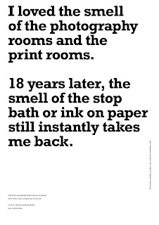
The design explored having yellow paint on a black background to see if this could be used as an organic touch to the design, of course related to the quote.


There also was an extensive experimentation with different layouts having as reference the concepts explored in the research. Typography was not important at the beginning, so it was used Helvetica since it is a flexible grotesk typeface. This was also an opportunity to experiment with colours, lights, ink textures, etc.


Since the poster was going to heavily rely on typographic work, there were several considerations about typefaces. First, the most basic typefaces needed to be explore to find the right tone of voice and from there it is a matter of defining it in more detail.


Helvetica - Reflection of modernity, open to interpretation in such a place full of different types of creative. It's a homage to Massimo Vignelli, a very important figure for graphic designers.

FF Meta - Young, yet experienced and confident.

Avenir - Nostalgious in a sad way

Univers - Corporate

Caslon - Nostalgious, romantic, academic

Clarendon - Café, experienced, kind

Rockwell - Successful designer sparing some time to university students to say something that helped her

Memphis - Typewriter, press, formal but excentric

It was found that Caslon was the most appropriate typeface to represent the quote for its connotations and tone. Other fonts similar to Caslon were tested, like Calluna (creative, smiling, welcoming), Leitura (sophisticated, sense of highness), Droid (firm handshake) or Cardea (Organic and artificial, like scraps of paper). From this second group, Calluna was the most appropriate, but it was too playful for the quote, so Caslon was the chosen one.

Microtypographically speaking, the text was adjusted in many different ways so the lines didn't form geometrical shapes to make it look more alive and less distracting. Also, it was a good opportunity to experiment which words needed to be highlighted and balance those highlighted words with the composition. The kerning was also manually adjusted.

The experimentaton with colours also pointed out that white and yellow could inhabit in the same space as long as they weren't the background for each other. In other words, yellow text on white background and viceversa is very difficult to read. Using a white or yellow background limits the other colours that can be chosen for the text.

A black background not only solves this problem, but it is more appropriate for the quote, as it makes it more private. Text can be shown in yellow and white can be used to highlight the important parts. This way the words can be quickly read.


The small text at the top and bottom was eventually fixed to bring a more consolidated structure to the poster. The text is:

Top: Leeds Arts University

Bottom: Leanne Taylor, 2001. Designed by Alex Zorita. alexzorita.com. In collaboration with Peter and Paul.

The following images show the evolution of the design.


The design received feedback from other designers from the Discord community Designers Creed before submitting the first draft to Peter and Paul.

They pointed out that the way the quote was breaking up needed to be fixed, and one member of the community that is a poet helped me with this bit. The problem was that the priority was ont he shape of the paragraphs instead of phrasing it with rythim.

They suggested to change the typeface for something that made it more of a strong statement, but I disagreed with this point as it is not a strong statement and the justification behind choosing Caslon seemed stronger than their arguments.

When asked if the design should have something else to represent what it's been said I was encouraged to keep the design only with text.


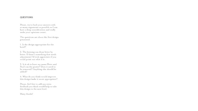
The design at this point was submitted to Peter and Paul in order to get feedback. This is what they received:


The questions I had for them were very specific, as Peter and Paul must be very busy giving feedback to the other 47 designs. The purpose was to make it easy and quickly for them.

Their feedback said:

We actually prefer the top left option on the 'other designs' you supplied and we'd like to see this route developed. 
One way you could do this would be to introduce a photographic element - this could be adding in an image or photographing the type itself. We would like to see a few options of this. 
With regards to the names, these don't need to be included on the poster as there will be credits elsewhere.


Printing or making the type wasn't a realistic way to approach this due to time limitations (The feedback was received a week before the final deadline). Since a personal practice is the analogue photography, a good idea could be to use one of these photographies. The noise from analogue film and black and white can relate not only to the photographic practice but also to the past.

The design went through different typographic and photographic experimentation. As the text has to split (so it takes the reader back just like the quote says), it must be readable keeping the balance of the composition. It feels more natural to leave the letters randomly cut instead of making the margin cut straight through a space between words or letters. The text being off is also a direct relation to film photography that comes out off.

The photography that was eventually chosen was the one with the horizon, as it is something that's looked at for contemplation and remembrance. Left the grainy noise and the marks from the film to make the viewer aware of the presence of the photography. The horizon in black and white also helps to structure the text. Next to the name of the author of the quote, there's the location of the photography and the year it was taken, a common practice with analogue photography.


This was the final piece initially submitted.


The second round of Feedback from Peter and Paul pointed out that this direction was better than the first one, but they wanted to see the text in sans-serif. For that, the project was resubmitted and this time with the previous submission plus 2 other alternatives in sans-serif. These typefaces were chosen based on the previous experimentation with Avenir and Helvetica. The first poster is in Helvetica (connotations previously explained) and the second one is in Le Havre, which had a feel of being handwritten (despite not being a script typography) and more personal. The text was adjusted so the edges of the poster cut through the middle of a space or a letter. It's not exact, but the purpose is that it doesn't cut leaving a small piece out to make it look that it's done on purpose and nothing is left to randomness.


After some more back and forth they also pointed out that the text of the credits should be removed for reasons behind the composition. They also wanted to reduce the leading and stick to Helvetica. For that, the grid was created again to match the font size and have a correct leading in relation to the aspect ratio. This is the final design they approved.